
harles

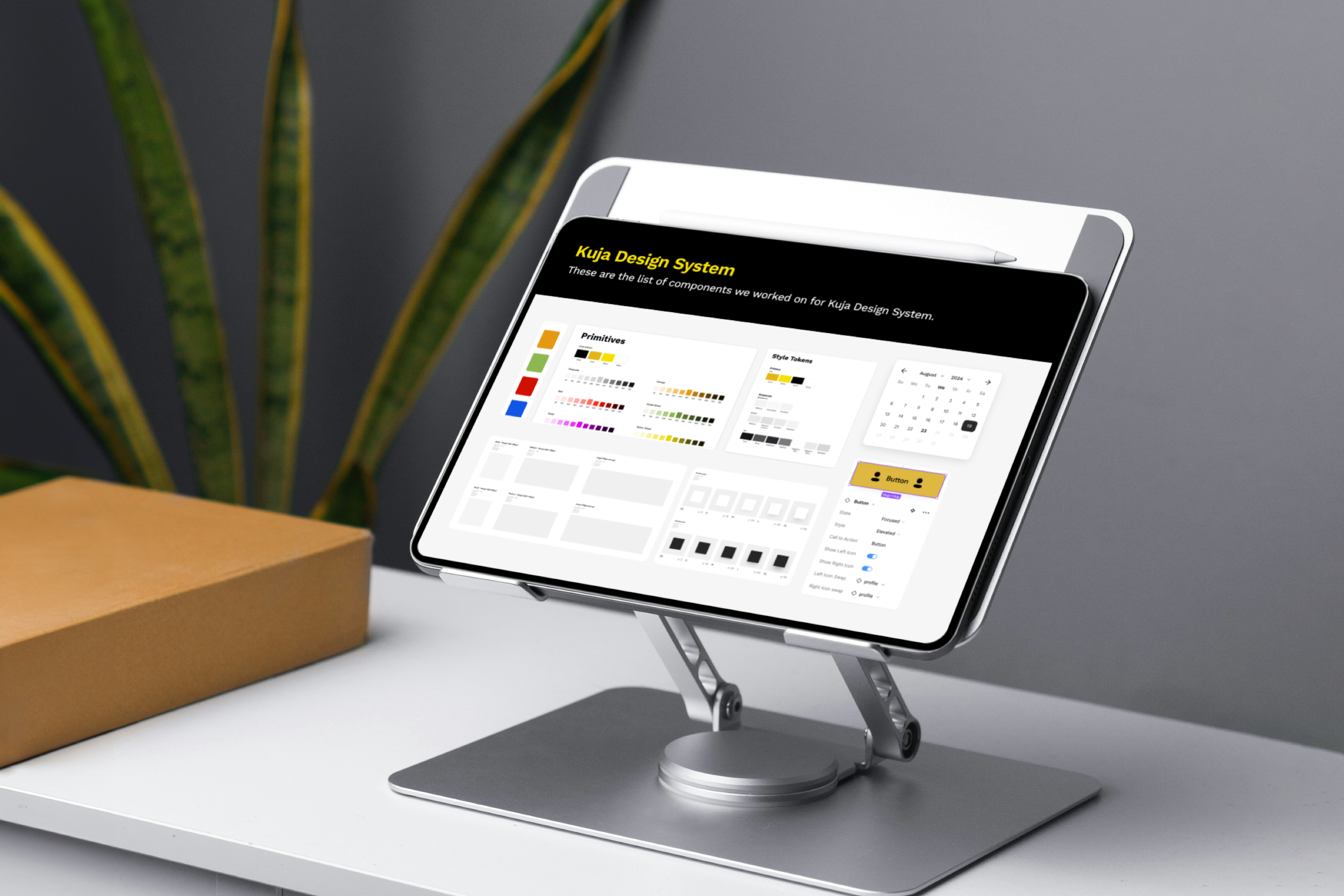
Kuja Design System
Role
Snr Product Designer
Company
ABinBev
Industry
Beverage and Logistics
Year
Completed 2025
As the Kuja ecosystem grew across products, platforms, and markets, the cracks in the design process became impossible to ignore. Prior to my joining the Kuja team, each product evolved with slightly different UI patterns, decisions were being re-made repeatedly, and both designers and engineers were spending unnecessary time resolving inconsistencies instead of moving forward. Scaling new features across multiple products and regions became slower and more complex than it needed to be.
That’s when the need for a design system became clear. We needed more than shared components we needed alignment. The Kuja Design System was created to act as a single source of truth, providing a shared language that brought design, engineering, and product teams onto the same page. Its role was to create consistency across the ecosystem, reduce friction in delivery, and enable Kuja products to scale faster and more confidently as the platform continued to grow.

How I contributed
My Role
I led the design of the Kuja Design System as the primary product designer, working closely with my design lead for support where needed.I began by auditing existing Kuja products to uncover inconsistencies in visual design, interactions, and component usage, which helped clarify where teams were losing time and alignment.
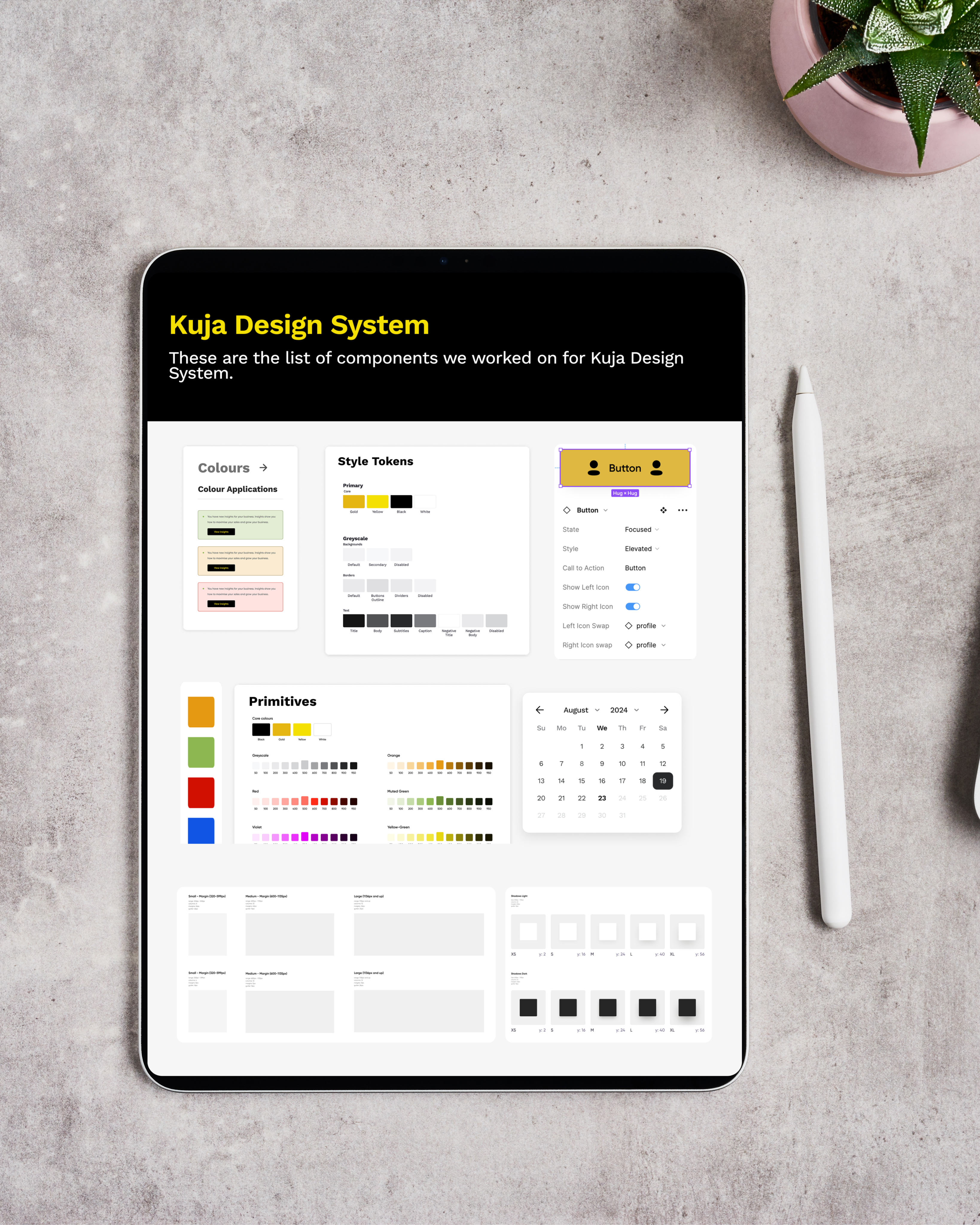
From there, I defined the core principles and foundations of the system: typography, color, spacing, and iconography and built a scalable library of reusable components that could work across both mobile and web. I documented clear usage guidelines and interaction states to support designers and engineers, and collaborated closely with product, design, and engineering teams to ensure the system solved real product needs and was adopted smoothly across the Kuja ecosystem.
The Challenge
Before the design system existed, I experienced firsthand how fragmented the UI had become across Kuja products. Each product evolved with its own patterns, which led to repeated design decisions, slower design and development cycles, and extra engineering effort to maintain different implementations. As the ecosystem grew, it became increasingly difficult to scale new features consistently across products and markets, making the need for a shared system impossible to ignore.
Kuja Design System

Making it happen
My Approach
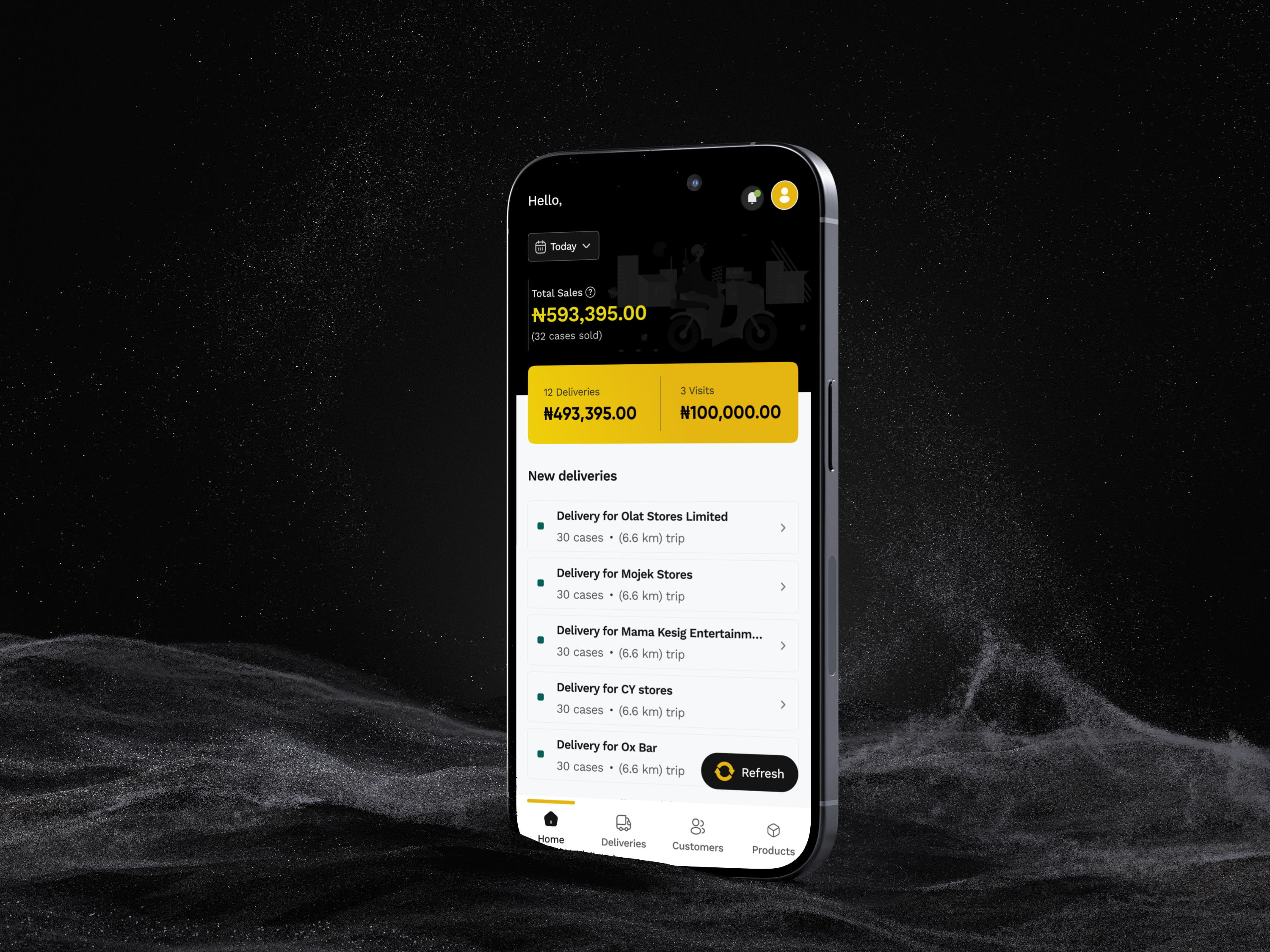
When shaping the Kuja Design System, I made a series of intentional decisions to create clarity, consistency, and flexibility across the ecosystem. I started by defining a set of core UI components: reusable buttons, form elements, tables, navigation, and feedback states that could work seamlessly across both web and mobile.
I introduced clear layout and spacing rules through consistent grids and spacing systems to reduce visual inconsistency and improve readability. I also standardized interaction patterns, defining how loading states, errors, empty states, and confirmations should behave so users could rely on familiar responses across products.
Accessibility was a key consideration throughout. I prioritized color contrast, legible typography, and comfortable tap targets to ensure the system worked well across diverse devices and real-world environments. Finally, I designed every component to flex across different Kuja products while still maintaining a unified visual identity for the ecosystem.

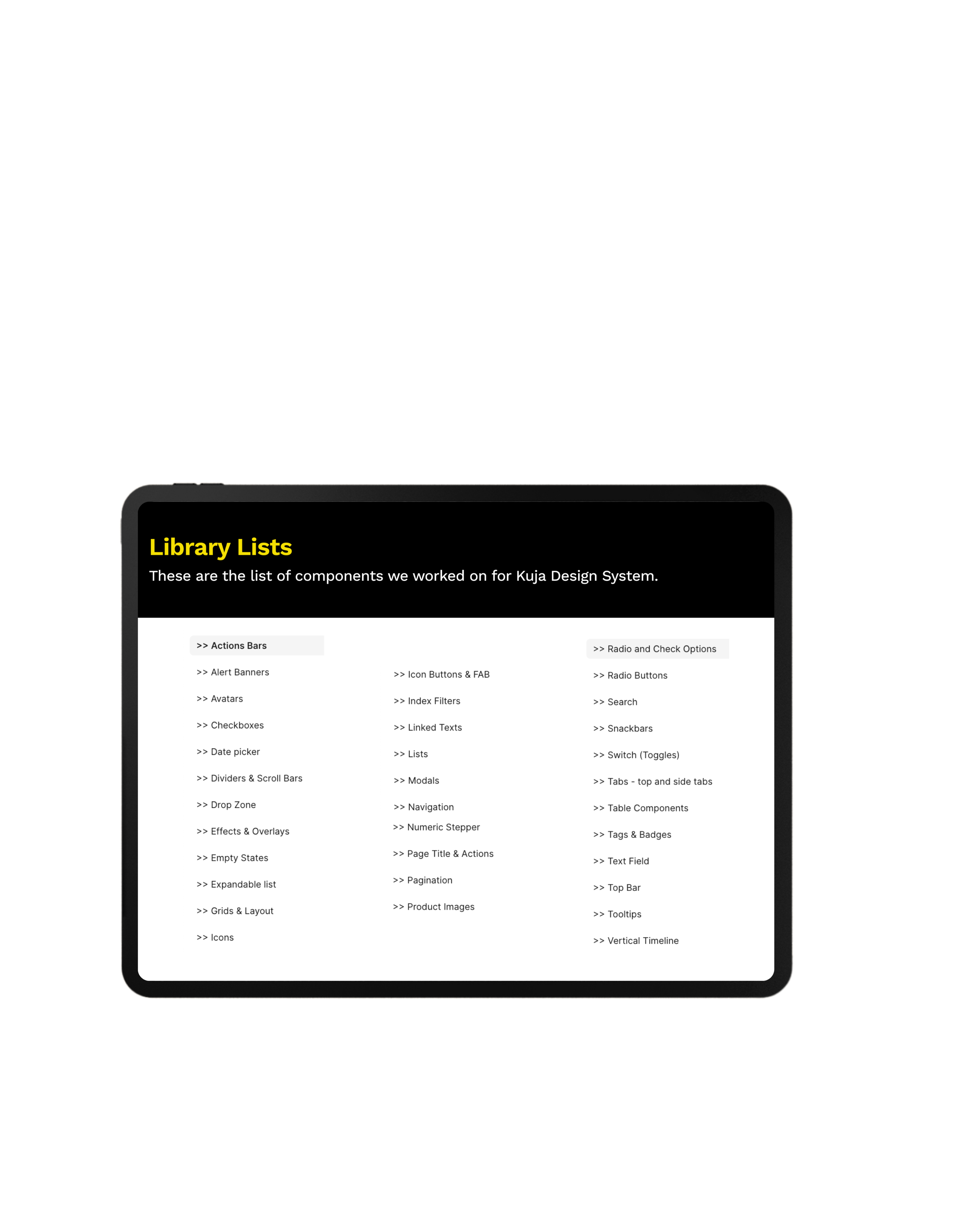
Library list and use cases
✔ Complete list: These are the lists of all the components we have built on Kuja. There’s continuously expansion to ensure consistency in the Kuja ecosystem.
✔ Use cases: Below are a few examples of some use cases of different elements in the Kuja Design System.
Date picker
✔ Different date options: Various date picker options to be used for different situations in Kuja designs.
Search and Filters
✔Search variations: Search components are used on different pages of the designs to find specific items or list of items. Search function has different states that are active based on interaction.
✔Index filter options: Index filter are used for filter drop-down options also for dates.
Tabs
✔Tab: Switch between different tab options. On the web, tabs have default states, hover states and active states. Consistency is maintained in both web and mobile tabs.
Table
✔ Table component set: Table components are used in the creation of tables across the designs. Modified to fit the unique requirements of each table information.
Input field
✔ Input field component: Various input field options. Text, drop-downs and uploads.
The new system
What we achieved
Results and impact
As the design system rolled out, I could clearly see its impact across the Kuja ecosystem. Teams were able to ship features faster by reusing well-defined components instead of starting from scratch. The experience across products became noticeably more consistent, giving users a more cohesive journey no matter which Kuja platform they used.
The system also helped reduce design debt by eliminating ad-hoc UI decisions and cutting down on rework. Designers and engineers began collaborating more smoothly around a shared language and set of standards. Most importantly, it created a scalable foundation that allowed new products and features to launch with far less friction as the ecosystem continued to grow.
What I learned
My takeaways
Working on the Kuja Design System was a turning point in how I think about design at scale. I realized that without a shared language, even the best ideas can get lost in translation between teams, and products start to feel fragmented. Leading the creation of a system that acted as a single source of truth taught me the value of foresight and anticipating how components, patterns, and rules could flex across multiple products while keeping the ecosystem consistent.
It also reinforced the power of collaboration. I worked closely with designers, engineers, and product managers to ensure the system didn’t just look good on paper, it solved real problems, sped up delivery, and reduced friction in day-to-day work. Seeing teams adopt the system, ship faster, and build with confidence made me appreciate how thoughtful systems thinking can elevate not just the product, but the entire organization.
Ultimately, the Kuja Design System taught me that consistency isn’t just about aesthetics, it’s about creating clarity, efficiency, and trust at every level of the product experience.THANK YOU.

harles


Copyright 2025 by Charles Nwafor

Kuja Design System
Role
Snr Product Designer
Company
ABinBev
Industry
Beverage and Logistics
Year
Completed 2025
As the Kuja ecosystem grew across products, platforms, and markets, the cracks in the design process became impossible to ignore. Prior to my joining the Kuja team, each product evolved with slightly different UI patterns, decisions were being re-made repeatedly, and both designers and engineers were spending unnecessary time resolving inconsistencies instead of moving forward. Scaling new features across multiple products and regions became slower and more complex than it needed to be.
That’s when the need for a design system became clear. We needed more than shared components we needed alignment. The Kuja Design System was created to act as a single source of truth, providing a shared language that brought design, engineering, and product teams onto the same page. Its role was to create consistency across the ecosystem, reduce friction in delivery, and enable Kuja products to scale faster and more confidently as the platform continued to grow.

How I contributed
My Role
I led the design of the Kuja Design System as the primary product designer, working closely with my design lead for support where needed.I began by auditing existing Kuja products to uncover inconsistencies in visual design, interactions, and component usage, which helped clarify where teams were losing time and alignment.
From there, I defined the core principles and foundations of the system: typography, color, spacing, and iconography and built a scalable library of reusable components that could work across both mobile and web. I documented clear usage guidelines and interaction states to support designers and engineers, and collaborated closely with product, design, and engineering teams to ensure the system solved real product needs and was adopted smoothly across the Kuja ecosystem.
The Challenge
Before the design system existed, I experienced firsthand how fragmented the UI had become across Kuja products. Each product evolved with its own patterns, which led to repeated design decisions, slower design and development cycles, and extra engineering effort to maintain different implementations. As the ecosystem grew, it became increasingly difficult to scale new features consistently across products and markets, making the need for a shared system impossible to ignore.
KujaDesignSystem
Making it happen
My Approach
When shaping the Kuja Design System, I made a series of intentional decisions to create clarity, consistency, and flexibility across the ecosystem. I started by defining a set of core UI components: reusable buttons, form elements, tables, navigation, and feedback states that could work seamlessly across both web and mobile.
I introduced clear layout and spacing rules through consistent grids and spacing systems to reduce visual inconsistency and improve readability. I also standardized interaction patterns, defining how loading states, errors, empty states, and confirmations should behave so users could rely on familiar responses across products.
Accessibility was a key consideration throughout. I prioritized color contrast, legible typography, and comfortable tap targets to ensure the system worked well across diverse devices and real-world environments. Finally, I designed every component to flex across different Kuja products while still maintaining a unified visual identity for the ecosystem.
Library list and use cases
✔ Complete list: These are the lists of all the components we have built on Kuja. There’s continuously expansion to ensure consistency in the Kuja ecosystem.
✔ Use cases: Below are a few examples of some use cases of different elements in the Kuja Design System.
Date picker
✔ Different date options: Various date picker options to be used for different situations in Kuja designs.
Search and Filters
✔Search variations: Search components are used on different pages of the designs to find specific items or list of items. Search function has different states that are active based on interaction.
✔Index filter options: Index filter are used for filter drop-down options also for dates.
Tabs
✔Tab: Switch between different tab options. On the web, tabs have default states, hover states and active states. Consistency is maintained in both web and mobile tabs.
Table
✔ Table component set: Table components are used in the creation of tables across the designs. Modified to fit the unique requirements of each table information.
Input field
✔ Input field component: Various input field options. Text, drop-downs and uploads.
The new system
What we achieved
Results and impact
As the design system rolled out, I could clearly see its impact across the Kuja ecosystem. Teams were able to ship features faster by reusing well-defined components instead of starting from scratch. The experience across products became noticeably more consistent, giving users a more cohesive journey no matter which Kuja platform they used.
The system also helped reduce design debt by eliminating ad-hoc UI decisions and cutting down on rework. Designers and engineers began collaborating more smoothly around a shared language and set of standards. Most importantly, it created a scalable foundation that allowed new products and features to launch with far less friction as the ecosystem continued to grow.
What I learned
My takeaways
Working on the Kuja Design System was a turning point in how I think about design at scale. I realized that without a shared language, even the best ideas can get lost in translation between teams, and products start to feel fragmented. Leading the creation of a system that acted as a single source of truth taught me the value of foresight and anticipating how components, patterns, and rules could flex across multiple products while keeping the ecosystem consistent.
It also reinforced the power of collaboration. I worked closely with designers, engineers, and product managers to ensure the system didn’t just look good on paper, it solved real problems, sped up delivery, and reduced friction in day-to-day work. Seeing teams adopt the system, ship faster, and build with confidence made me appreciate how thoughtful systems thinking can elevate not just the product, but the entire organization.
Ultimately, the Kuja Design System taught me that consistency isn’t just about aesthetics, it’s about creating clarity, efficiency, and trust at every level of the product experience.THANK YOU.
harles
Copyright 2025 by Charles Nwafor
Kuja Design System
Role
Snr Product Designer
Company
ABinBev
Industry
Beverage and Logistics
Year
Completed 2025
As the Kuja ecosystem grew across products, platforms, and markets, the cracks in the design process became impossible to ignore. Prior to my joining the Kuja team, each product evolved with slightly different UI patterns, decisions were being re-made repeatedly, and both designers and engineers were spending unnecessary time resolving inconsistencies instead of moving forward. Scaling new features across multiple products and regions became slower and more complex than it needed to be.
That’s when the need for a design system became clear. We needed more than shared components we needed alignment. The Kuja Design System was created to act as a single source of truth, providing a shared language that brought design, engineering, and product teams onto the same page. Its role was to create consistency across the ecosystem, reduce friction in delivery, and enable Kuja products to scale faster and more confidently as the platform continued to grow.

How I contributed
My Role
I led the design of the Kuja Design System as the primary product designer, working closely with my design lead for support where needed.I began by auditing existing Kuja products to uncover inconsistencies in visual design, interactions, and component usage, which helped clarify where teams were losing time and alignment.
From there, I defined the core principles and foundations of the system: typography, color, spacing, and iconography and built a scalable library of reusable components that could work across both mobile and web. I documented clear usage guidelines and interaction states to support designers and engineers, and collaborated closely with product, design, and engineering teams to ensure the system solved real product needs and was adopted smoothly across the Kuja ecosystem.
The Challenge
Before the design system existed, I experienced firsthand how fragmented the UI had become across Kuja products. Each product evolved with its own patterns, which led to repeated design decisions, slower design and development cycles, and extra engineering effort to maintain different implementations. As the ecosystem grew, it became increasingly difficult to scale new features consistently across products and markets, making the need for a shared system impossible to ignore.
KujaDesignSystem
Making it happen
My Approach
When shaping the Kuja Design System, I made a series of intentional decisions to create clarity, consistency, and flexibility across the ecosystem. I started by defining a set of core UI components: reusable buttons, form elements, tables, navigation, and feedback states that could work seamlessly across both web and mobile.
I introduced clear layout and spacing rules through consistent grids and spacing systems to reduce visual inconsistency and improve readability. I also standardized interaction patterns, defining how loading states, errors, empty states, and confirmations should behave so users could rely on familiar responses across products.
Accessibility was a key consideration throughout. I prioritized color contrast, legible typography, and comfortable tap targets to ensure the system worked well across diverse devices and real-world environments. Finally, I designed every component to flex across different Kuja products while still maintaining a unified visual identity for the ecosystem.
Library list and use cases
✔ Complete list: These are the lists of all the components we have built on Kuja. There’s continuously expansion to ensure consistency in the Kuja ecosystem.
✔ Use cases: Below are a few examples of some use cases of different elements in the Kuja Design System.
Date picker
✔ Different date options: Various date picker options to be used for different situations in Kuja designs.
Search and Filters
✔Search variations: Search components are used on different pages of the designs to find specific items or list of items. Search function has different states that are active based on interaction.
✔Index filter options: Index filter are used for filter drop-down options also for dates.
Tabs
✔Tab: Switch between different tab options. On the web, tabs have default states, hover states and active states. Consistency is maintained in both web and mobile tabs.
Table
✔ Table component set: Table components are used in the creation of tables across the designs. Modified to fit the unique requirements of each table information.
Input field
✔ Input field component: Various input field options. Text, drop-downs and uploads.
The new system
What we achieved
Results and impact
As the design system rolled out, I could clearly see its impact across the Kuja ecosystem. Teams were able to ship features faster by reusing well-defined components instead of starting from scratch. The experience across products became noticeably more consistent, giving users a more cohesive journey no matter which Kuja platform they used.
The system also helped reduce design debt by eliminating ad-hoc UI decisions and cutting down on rework. Designers and engineers began collaborating more smoothly around a shared language and set of standards. Most importantly, it created a scalable foundation that allowed new products and features to launch with far less friction as the ecosystem continued to grow.
What I learned
My takeaways
Working on the Kuja Design System was a turning point in how I think about design at scale. I realized that without a shared language, even the best ideas can get lost in translation between teams, and products start to feel fragmented. Leading the creation of a system that acted as a single source of truth taught me the value of foresight and anticipating how components, patterns, and rules could flex across multiple products while keeping the ecosystem consistent.
It also reinforced the power of collaboration. I worked closely with designers, engineers, and product managers to ensure the system didn’t just look good on paper, it solved real problems, sped up delivery, and reduced friction in day-to-day work. Seeing teams adopt the system, ship faster, and build with confidence made me appreciate how thoughtful systems thinking can elevate not just the product, but the entire organization.
Ultimately, the Kuja Design System taught me that consistency isn’t just about aesthetics, it’s about creating clarity, efficiency, and trust at every level of the product experience.THANK YOU.
Other projects
Elvo AI
Elvo AI mobile app design.
Kuja Drivers
Kuja Drivers mobile app design.
harles
Copyright 2025 by Charles Nwafor