
harles

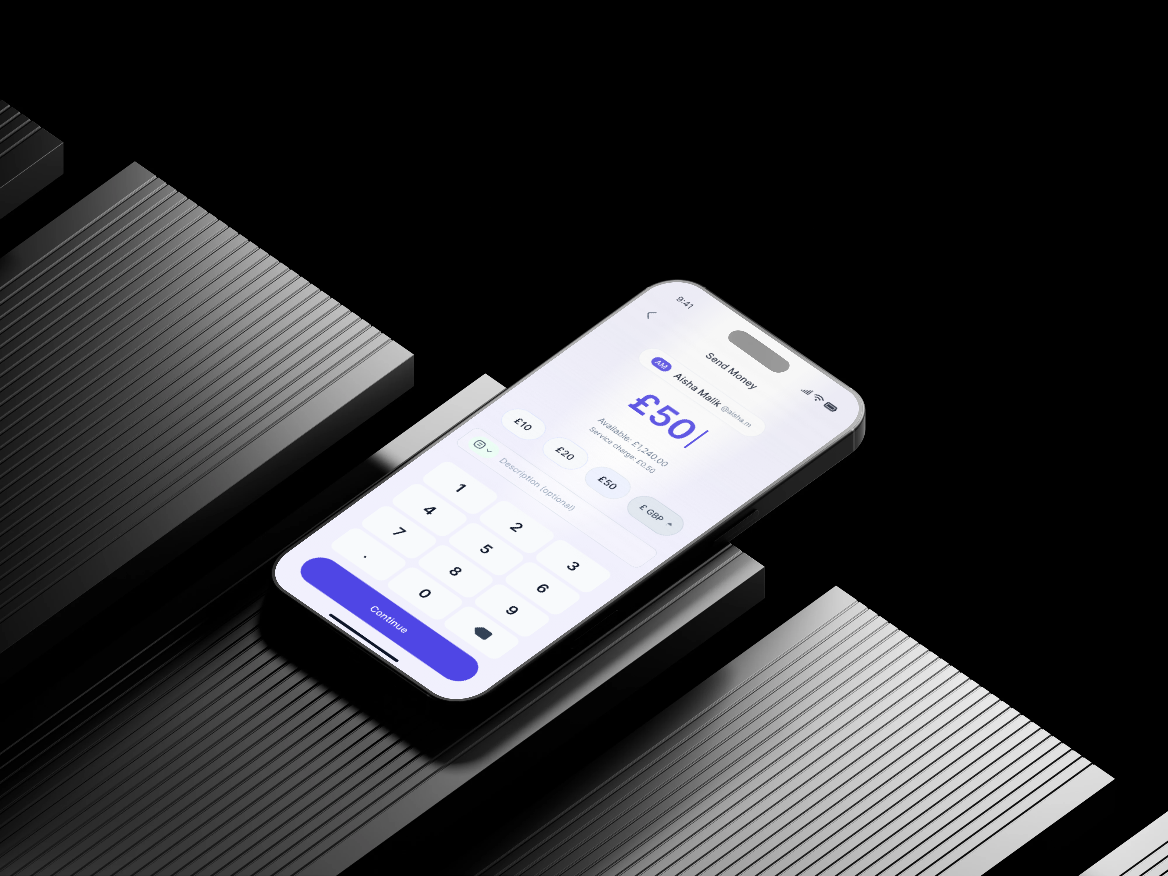
MAL mobile app
Role
Product Designer
Project Type
Personal Project
Industry
Fintech/Digital Banking
Year
Completed 2026
Mal - Send money case study
AI Gave Me a Blueprint. The Design Was Mine. MAL is a mobile money transfer app.
MAL is a Sharia-compliant money transfer app designed for Muslim users in the UAE. I used AI tools, including Claude and UX Pilot, to generate an initial draft of the send money flow. Rather than accepting that output as finished work, they critically examined it, questioned its decisions, and rebuilt it with genuine craft and conviction. The result is a case study in Design Authorship: the principle that AI can produce a starting point, but only a designer can produce a design. The prompt is not the work. Everything that happens after the prompt is.
The Product: MAL
About MAL
MAL is built for users who want to manage their finances without compromising their values. Sharia-compliant finance demands clarity: no interest, no ambiguity, and no language that obscures what money is doing, and those principles shaped every design decision in the flow. The project was intentionally scoped to the send money journey, the most critical sequence in any transfer product, spanning six screens and two edge cases. The goal was a flow that felt fast, trustworthy, and fully human. MAL was not built for a client, but as a demonstration that AI-assisted design still requires a designer's judgment, taste, and authorship at every step.
MAL
AI-Native App Design
The Challenge
Why this Design
Synthesized money transfer UX challenges and cultural design requirements. Most money transfer apps share the same friction points: too many steps, clinical amount screens, buried note fields, and error states that feel punishing rather than helpful. These are not edge cases but the everyday reality for millions of users who simply want to send money quickly and confidently. For MAL's users, these failures carry extra weight, since a flow that feels rushed, confusing, or undignified is not just poor UX but a product that falls short of their values. The brief required a flow that felt fast without feeling rushed, trustworthy without feeling cold, and Sharia-compliant without making compliance feel like a constraint. It is exactly the kind of layered, human design problem where AI can offer a useful starting point, but only an experienced designer can carry it to a meaningful finish.
Design Process
How I work with AI
Before any design work began, I built a structured brief around what I call Design Axioms: clear principles and boundaries defining what the product should be before any tool is involved. I fed that brief to Claude, which produced a detailed UX Pilot prompt document covering all six screens, and I used those prompts to generate the initial wireframes. The wireframes were functional, logically sound, and correctly applied Sharia-compliance rules throughout. But a starting point was all they were. What AI cannot do is question the brief it was given, sense when something feels spatially wrong, or make a product feel like it genuinely belongs to a specific person in a specific cultural context. I brought that judgment, took what was useful, discarded what was not, and built something the tool alone could never have reached. That is Design Authorship.
The Starting Point
What AI built
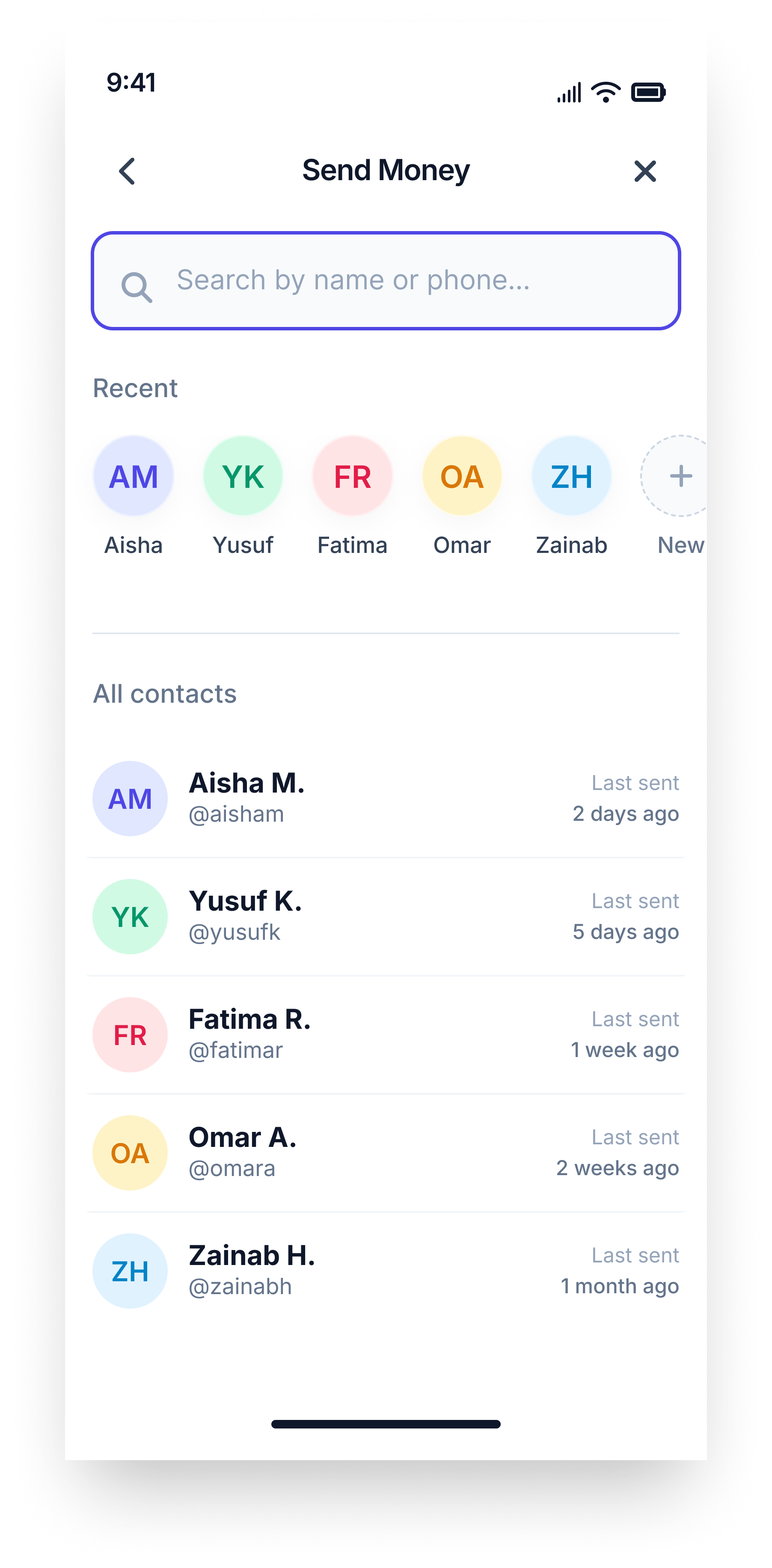
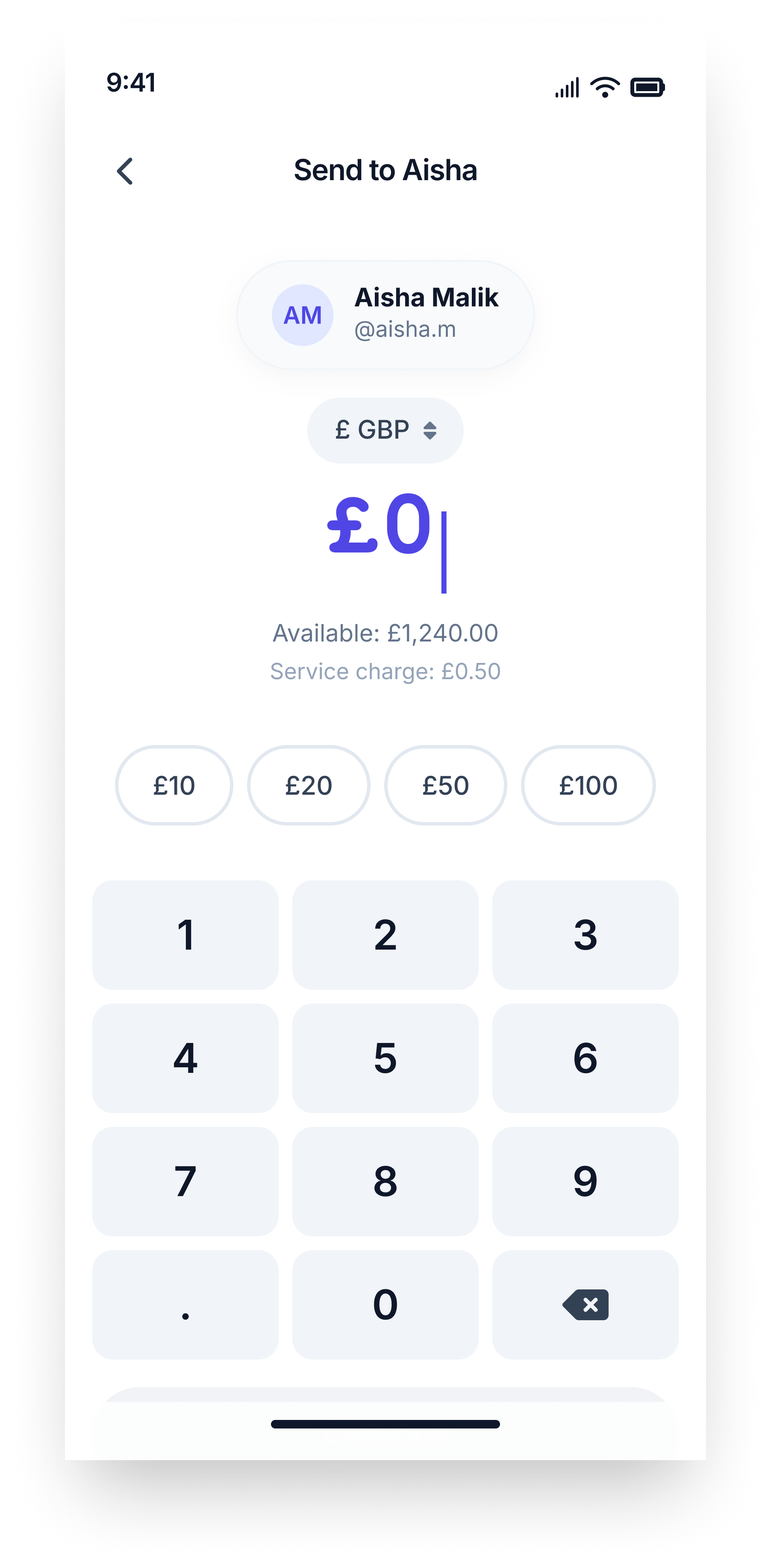
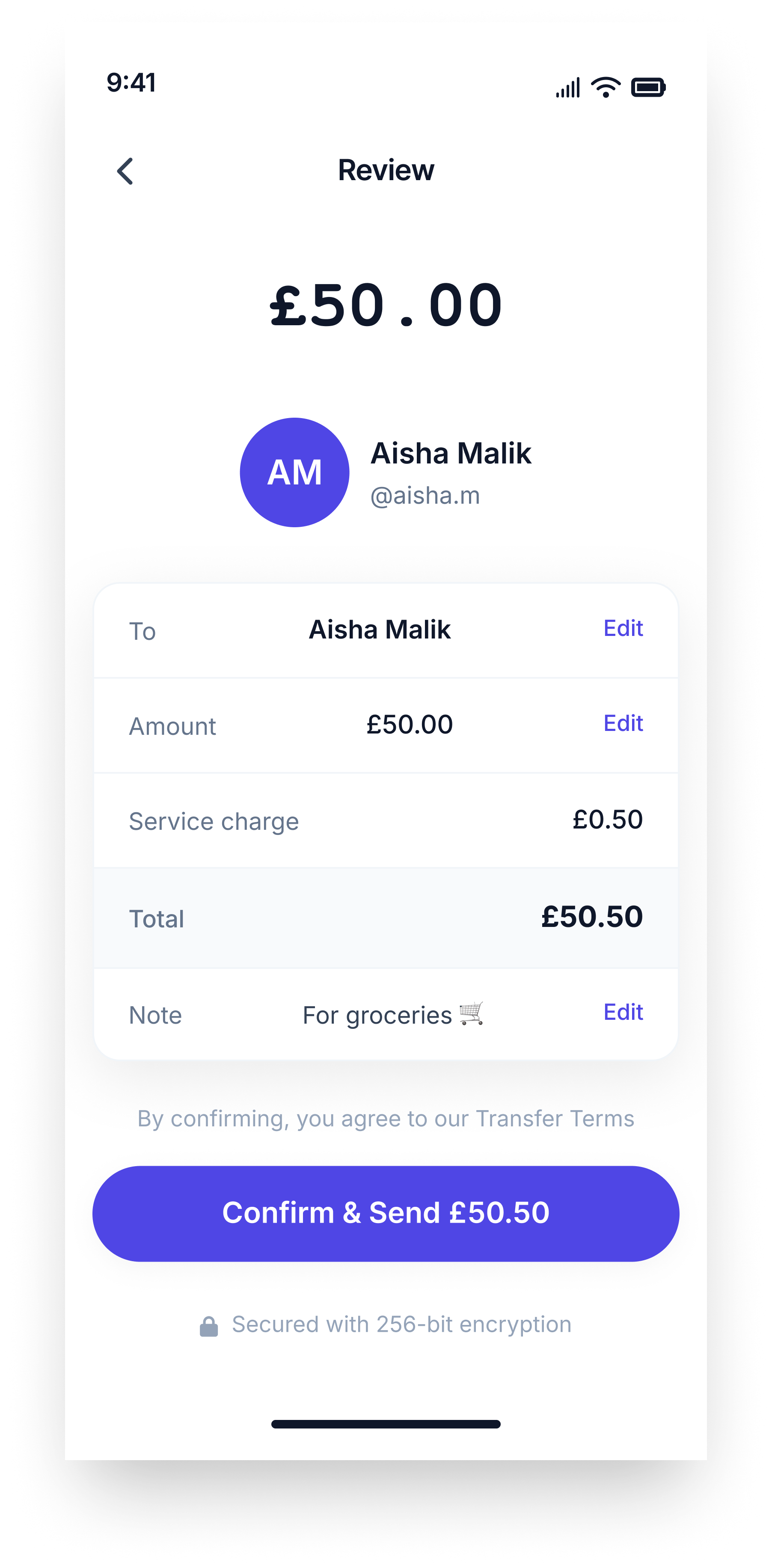
The UX Pilot wireframes were not bad, and I think it is important to say that clearly. The flow logic was sound, the screen sequence made sense, and the copy was Sharia-compliant throughout, using language like "service charge" and "transfer not completed" in all the right places. But looking at them screen by screen, the gaps became obvious. Pure white backgrounds gave the product no visual identity, an entire screen was wasted on an optional note field, the review screen never told users when their money would arrive, and every edge case state looked and felt identical regardless of outcome. These were not catastrophic failures, but they were exactly the gaps that separate a wireframe from a genuinely designed product. And closing those gaps was precisely what I was there to do.
Before - UX Pilot wireframe designs
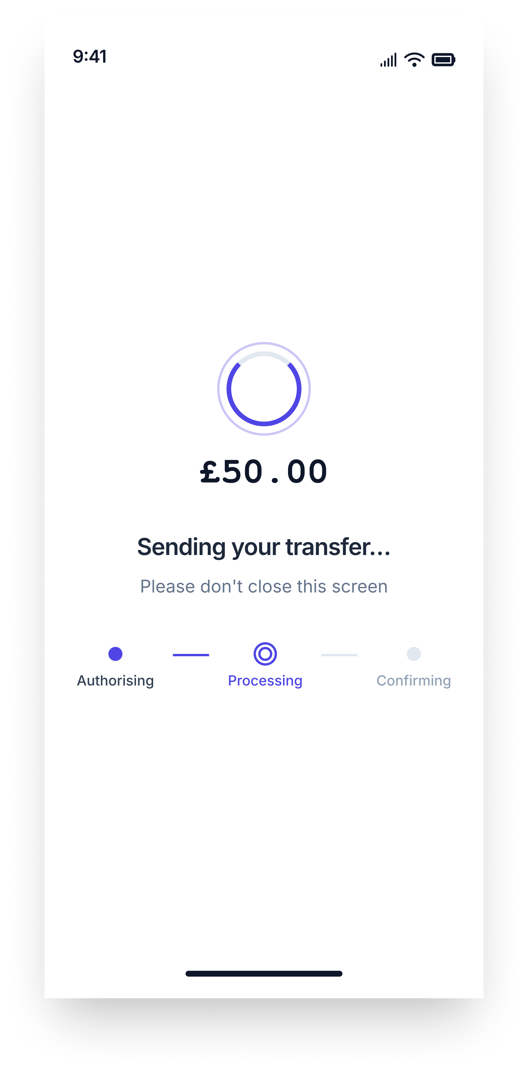
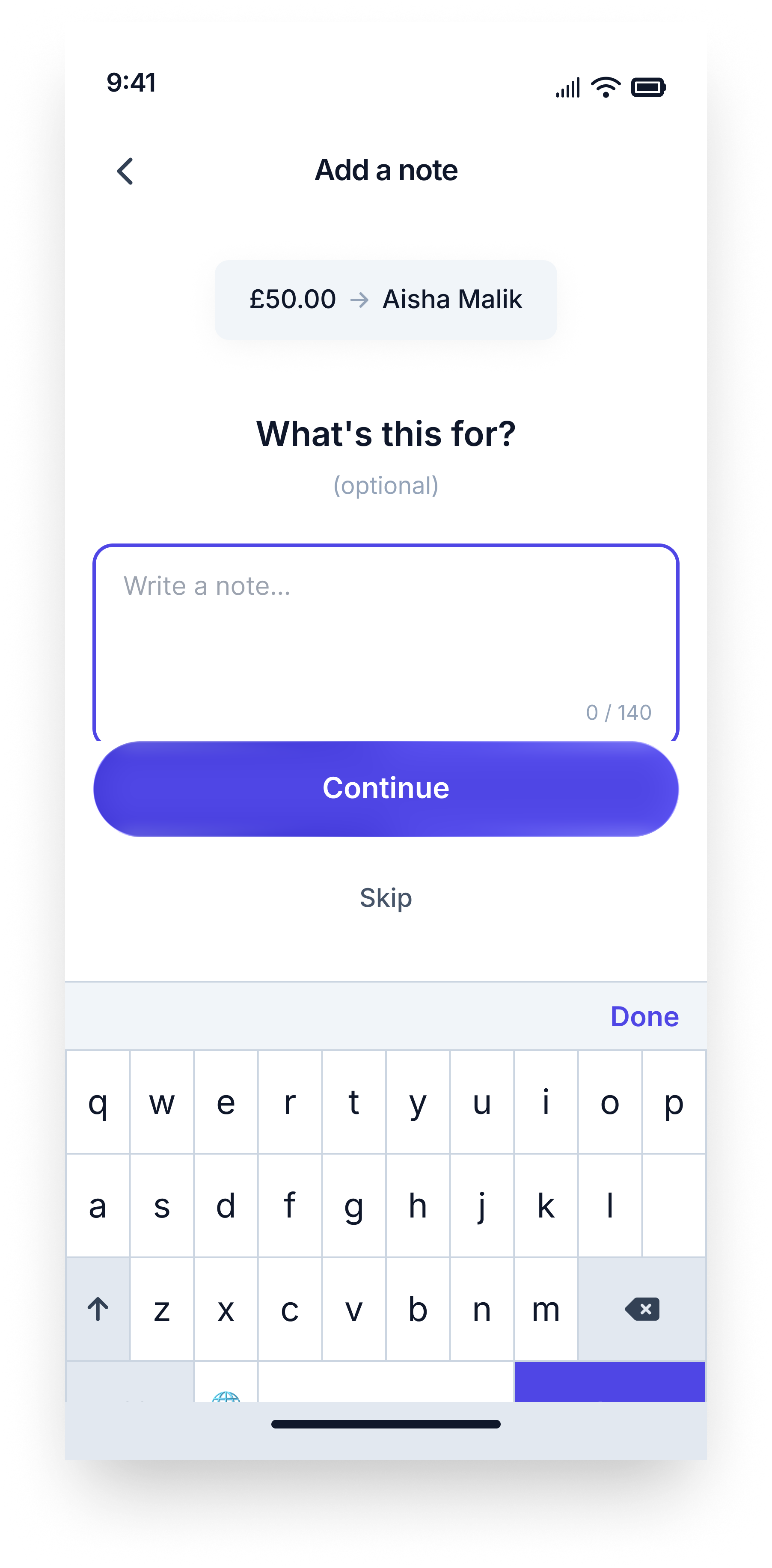
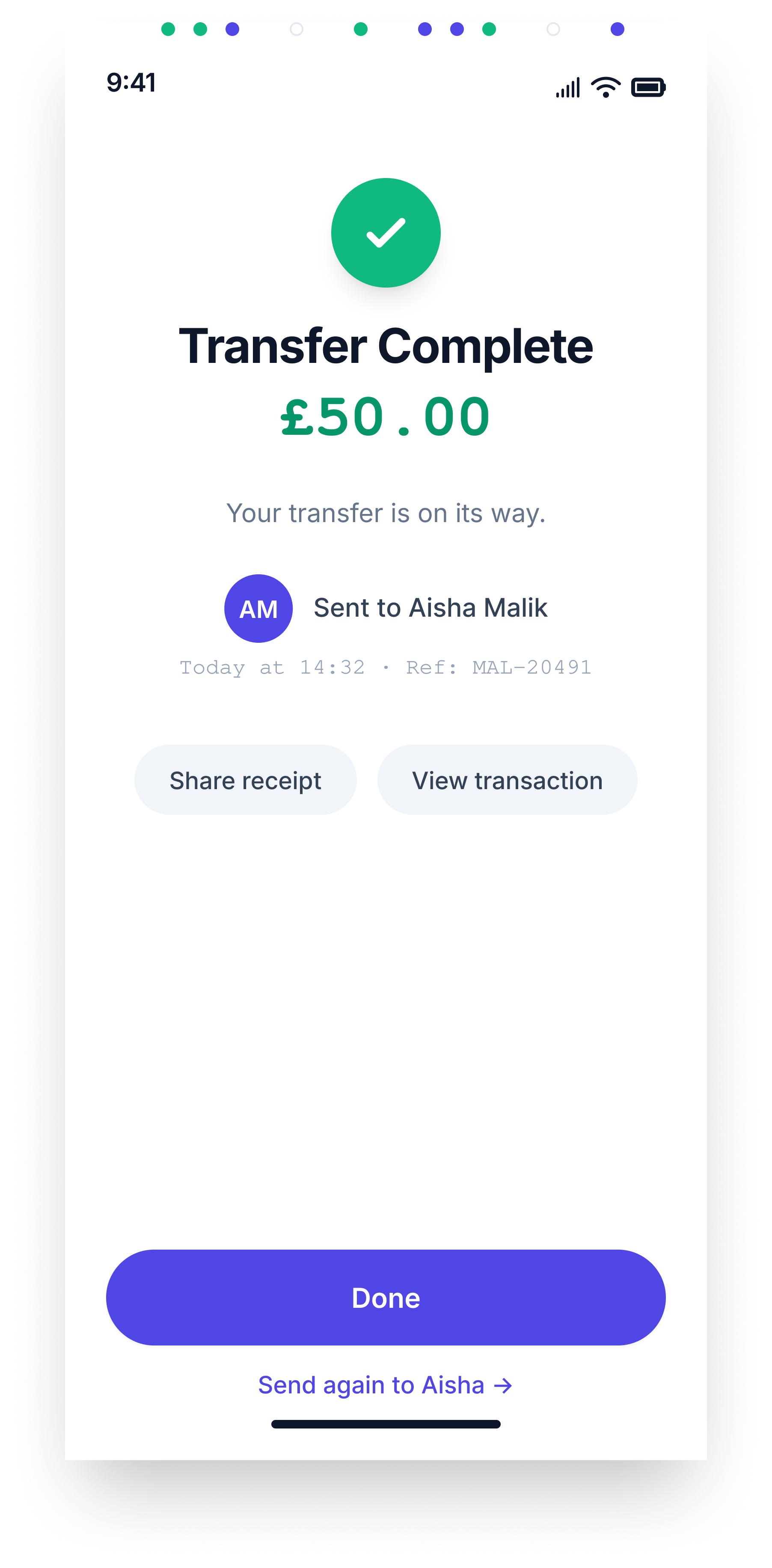
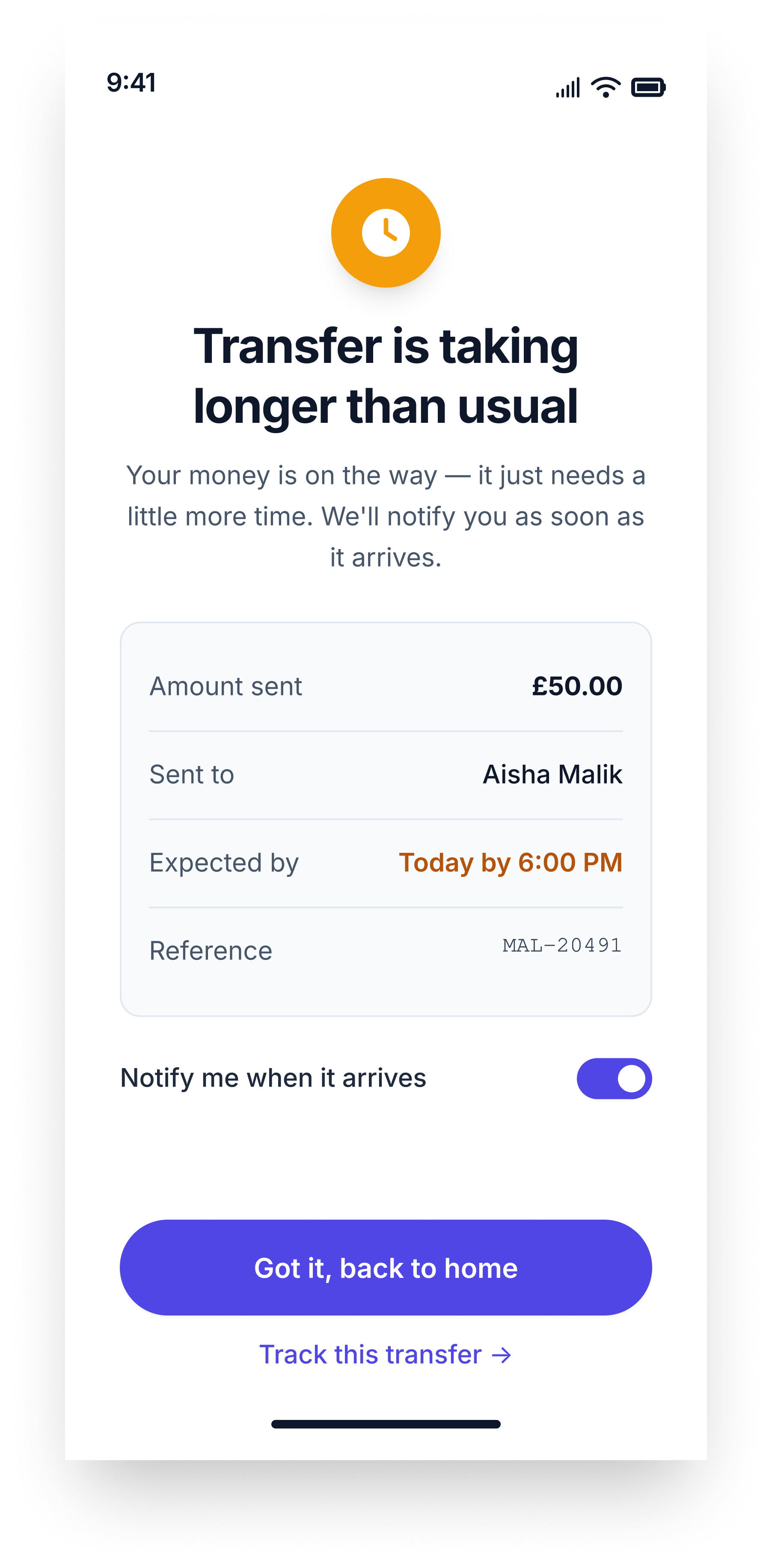
Where I stepped in
The evolution of MAL happened across four dimensions. Structure, UX, Visual Identity, and Copy. Each one represents a layer where designer judgment replaced AI instruction. Together, they represent the difference between a wireframe and a product.
Structure
My first question was not how to improve the screens, but whether all of them needed to exist. In one case, the answer was no. The AI had given an entire screen to adding a note, a field my own brief had described as optional, complete with its own navigation, heading, character counter, and skip button. I removed it entirely, moving the description field directly onto the amount entry screen as a compact input, there if you want it and out of the way if you do not. The flow went from six screens to five, and users never have to consciously decide whether to skip a step that should never have been its own step. I also moved the currency selector off its isolated row and into the quick-amount chips row, so one row now does two jobs and the screen breathes better for it.
Structural upgrade from UX pilot vs Final design
UX
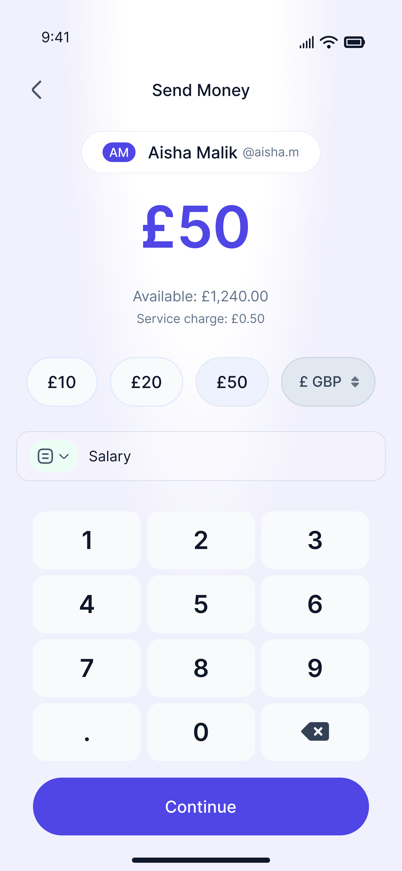
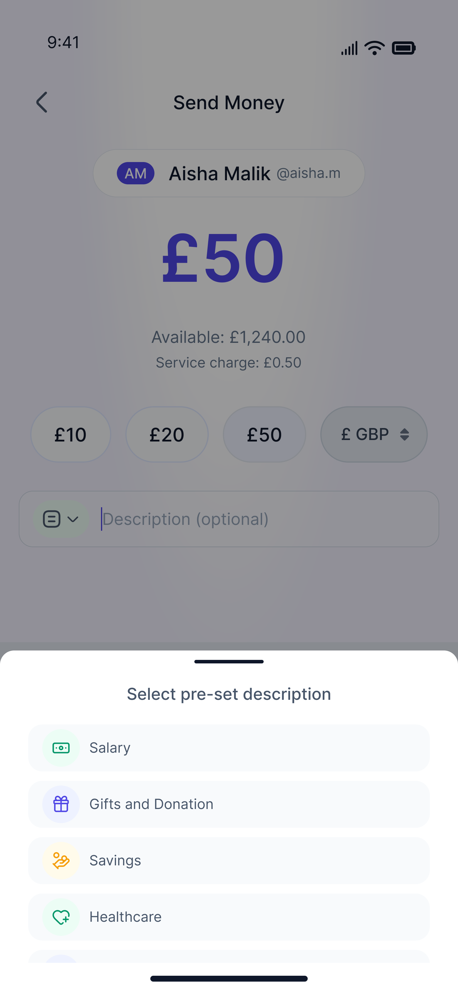
With the structure settled, I turned my attention to how the product actually behaved. I replaced the AI's suggested emoji chips for the description field with a properly structured bottom sheet modal offering contextual preset options like Salary, Gifts, Healthcare and Savings, categories that reflect why MAL's users actually send money. I pinned the Continue button to the bottom of the screen in a fixed position so it is always visible, removing any chance a user has to discover how to proceed. I also designed the description field as a full interaction with distinct empty, focused, filled, and modal states rather than a single static component. The most meaningful addition came on the review screen, where I added an estimated arrival time row to the transfer summary card. For a product built entirely on trust, telling users when their money will arrive is not a nice detail to include. It is a requirement.
Review screen from UX Pilot vs Final design
Copy and paste
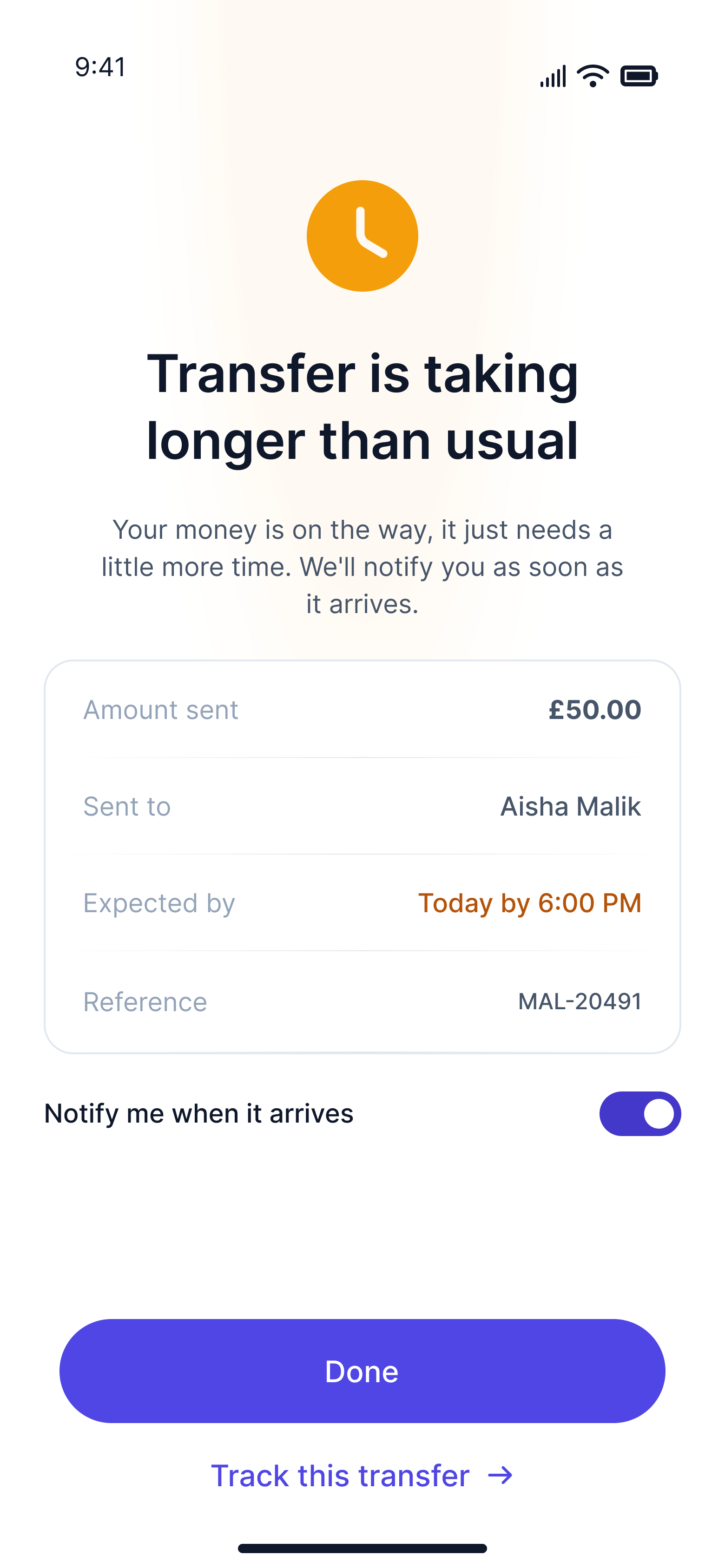
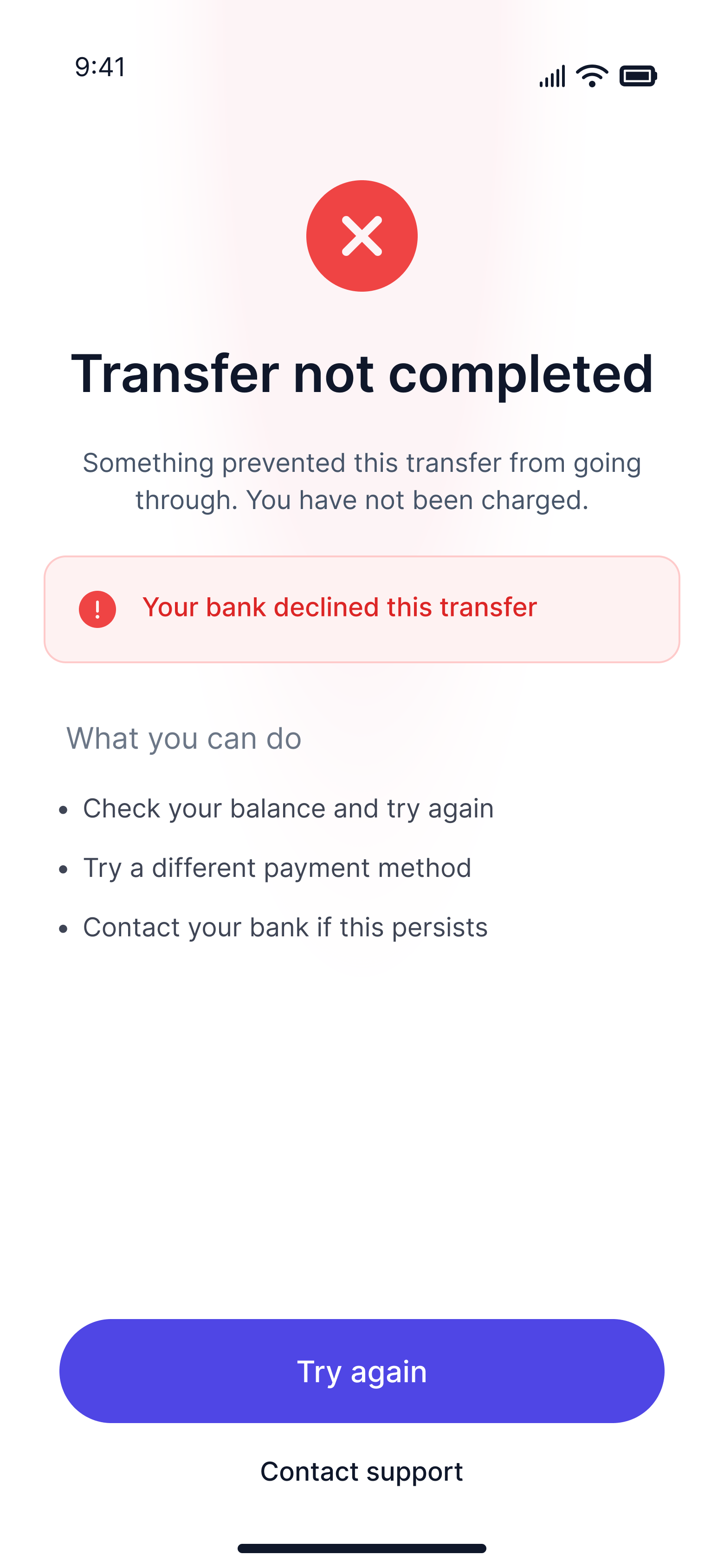
Some of the smallest changes I made carry the most weight. On the delayed transfer screen, I replaced "Got it, back to home" with simply "Done," removing the sense that the app was narrating the user's own action back to them. On the success screen, I changed "Your transfer is on its way" to "Your transfer has been sent," because in a financial product, certainty is more reassuring than warmth. I also moved away from all-caps section labels and inconsistent title casing across the error and edge case screens, because capitalisation carries tone, and the original choices felt institutional rather than human. None of these are cosmetic decisions. They are the kind of precise, considered calls that only come from a designer who understands the emotional register a product needs to hit at every moment. Across twelve decisions and four dimensions, each one closed the gap between what the AI produced and what MAL actually needed to be.
Copy sample from UX Pilot vs Final design
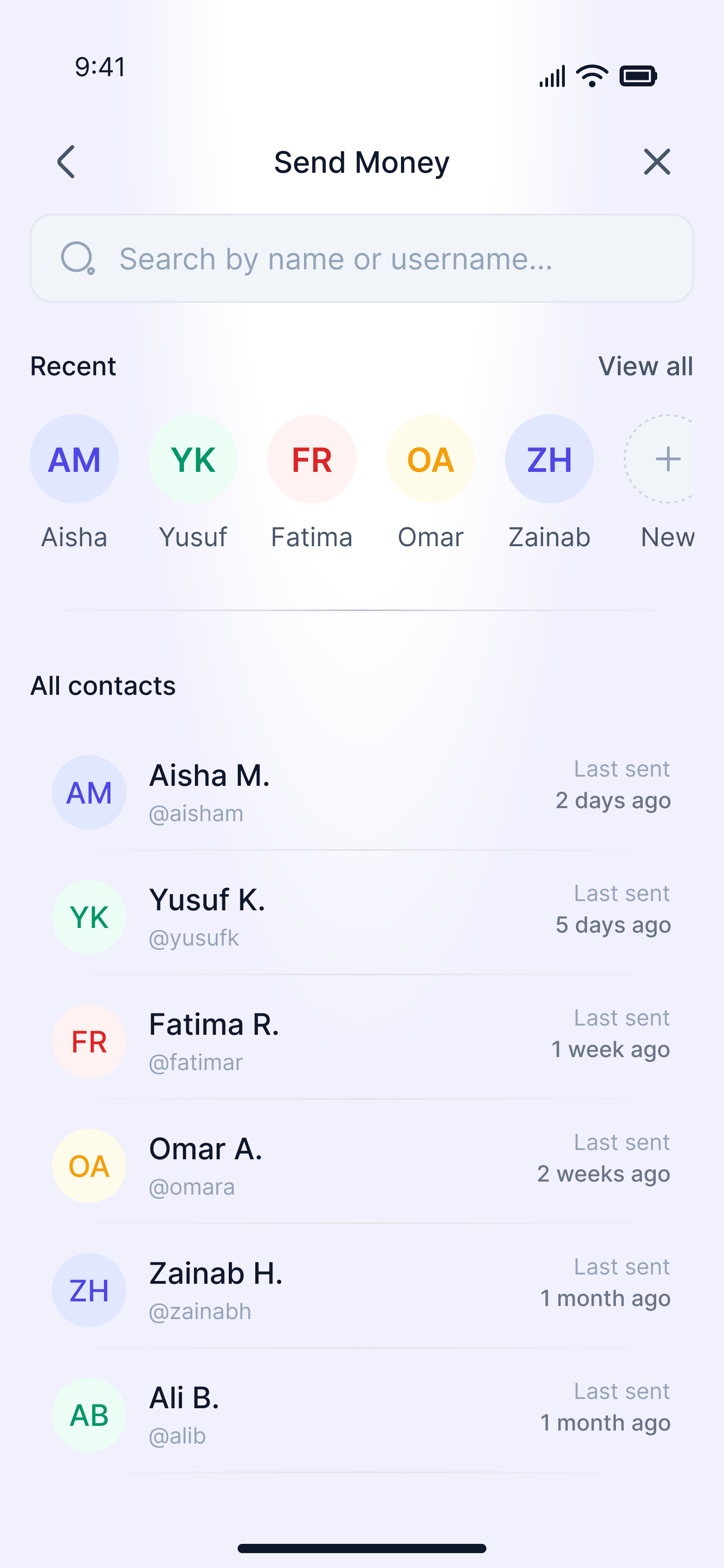
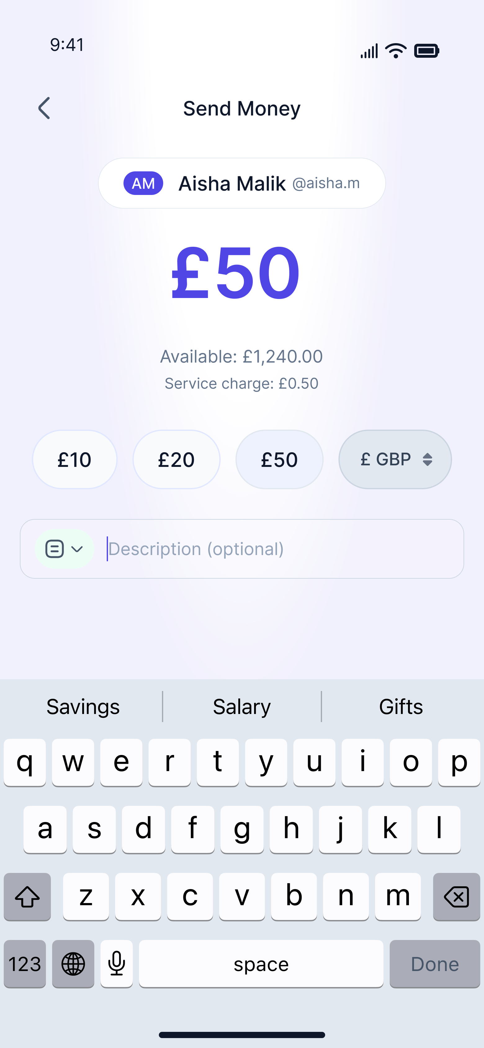
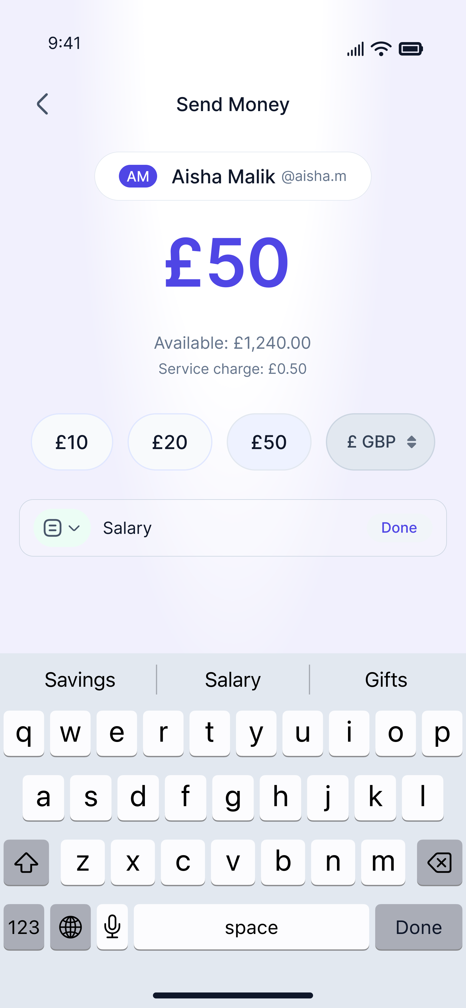
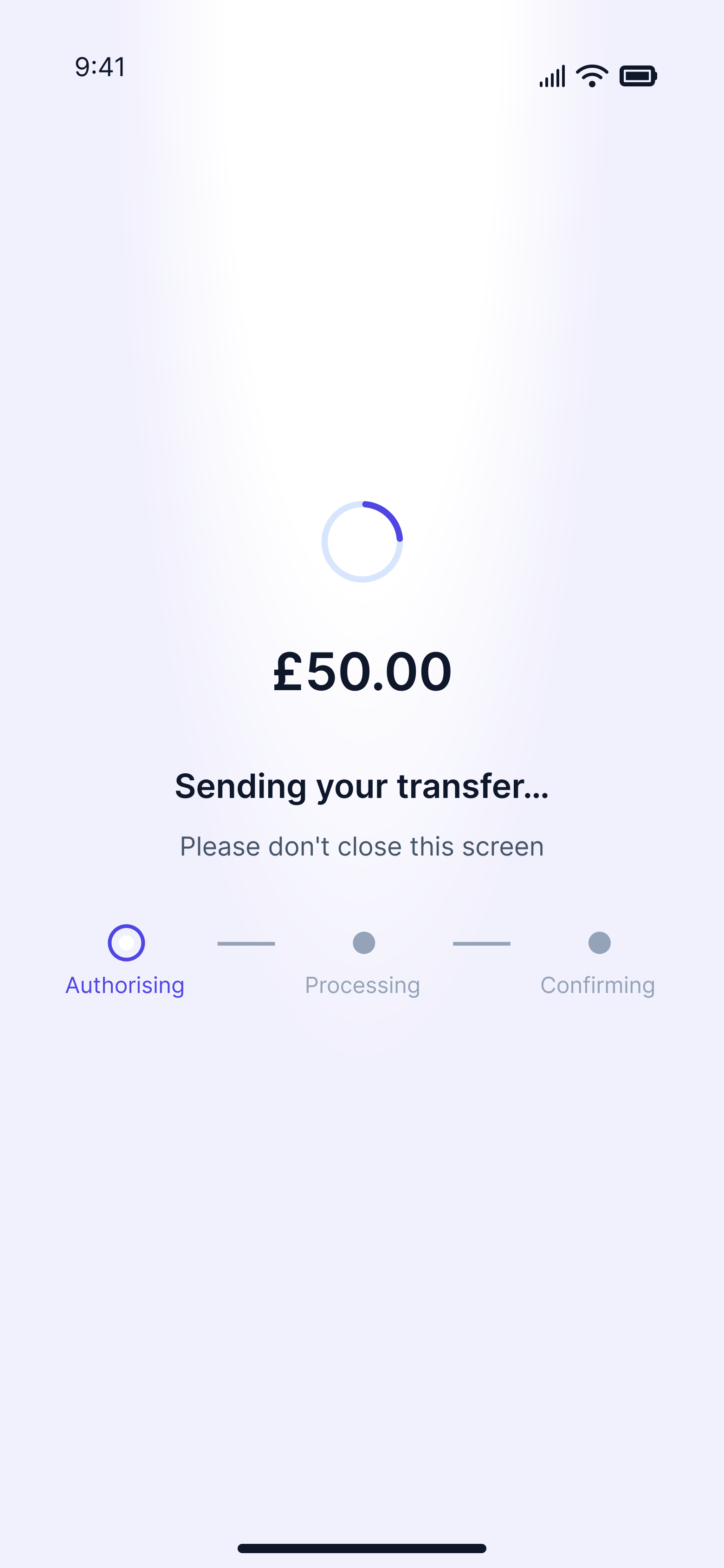
After - Elevated high-fidelity mockups
Decisions that defined the work
Of the twelve improvements made across the MAL send money flow, three stand apart. Not because the others were minor, but because these three required something AI cannot replicate. They required a designer to look at what existed, question whether it should exist at all, and make a call that no prompt could have produced.
Removing the note screen
The AI built a complete, fully specified screen dedicated to adding a note, and by the standards of my own brief, it was correct. It was also wrong, not in what it contained, but in the fact that it existed at all. A screen built around an optional field forces users to make a conscious decision about something that was never mandatory, and every unnecessary step in a financial flow is a moment where someone can second-guess, drop off, or simply feel that the process is longer than it should be. I removed it entirely, moving the description field onto the amount entry screen as a compact, unobtrusive input, present for users who want it and invisible as a burden for those who do not. The flow became one step shorter and measurably more respectful of the user's time. An AI following a brief will always build what the brief describes. It takes a designer to ask whether the brief was right.
Description
Rethinking the description interaction
The AI proposed emoji chip shortcuts for common note categories, and the intent was right: reduce the cognitive load of filling in a free-text field. But the execution was wrong for this user. MAL's users are adults sending money for real, recurring, meaningful reasons, and they deserve a description system that treats their use case with the same seriousness the rest of the product does. I replaced the emoji chips with a structured bottom sheet modal containing categorised preset descriptions, Salary, Gifts and Donation, Savings, Healthcare, each with a contextual icon. It is faster than typing, more dignified than emoji shortcuts, and directly relevant to why this demographic actually sends money. Making that call required knowing who the user is, not just what the brief said about them, and that knowledge does not live in a prompt.
Description
Unique color language for the entire product
This is where MAL stopped being a wireframe and started being a product. I replaced the AI's pure white backgrounds with a soft periwinkle and lavender tone across all neutral screens, subtle enough not to compete with the content but distinct enough to give MAL a visual identity that does not look like Revolut, Wise, or any other fintech app. I also built a contextual colour language for every outcome state: soft green for success, soft red for a failed transfer, and warm amber for a delayed one, so users feel the difference before they read a single word. The AI had suggested this treatment for the success screen only. I recognised it as a system and applied it consistently across all states, because that is the difference between following a prompt and designing with intent. I also tightened the recipient pill on the amount screen, properly embedding the avatar within the container alongside the name and username to create one cohesive, intentional unit rather than a loosely assembled collection of elements.
Description
MAL: send money flow prototype
The outcome
What was achieved
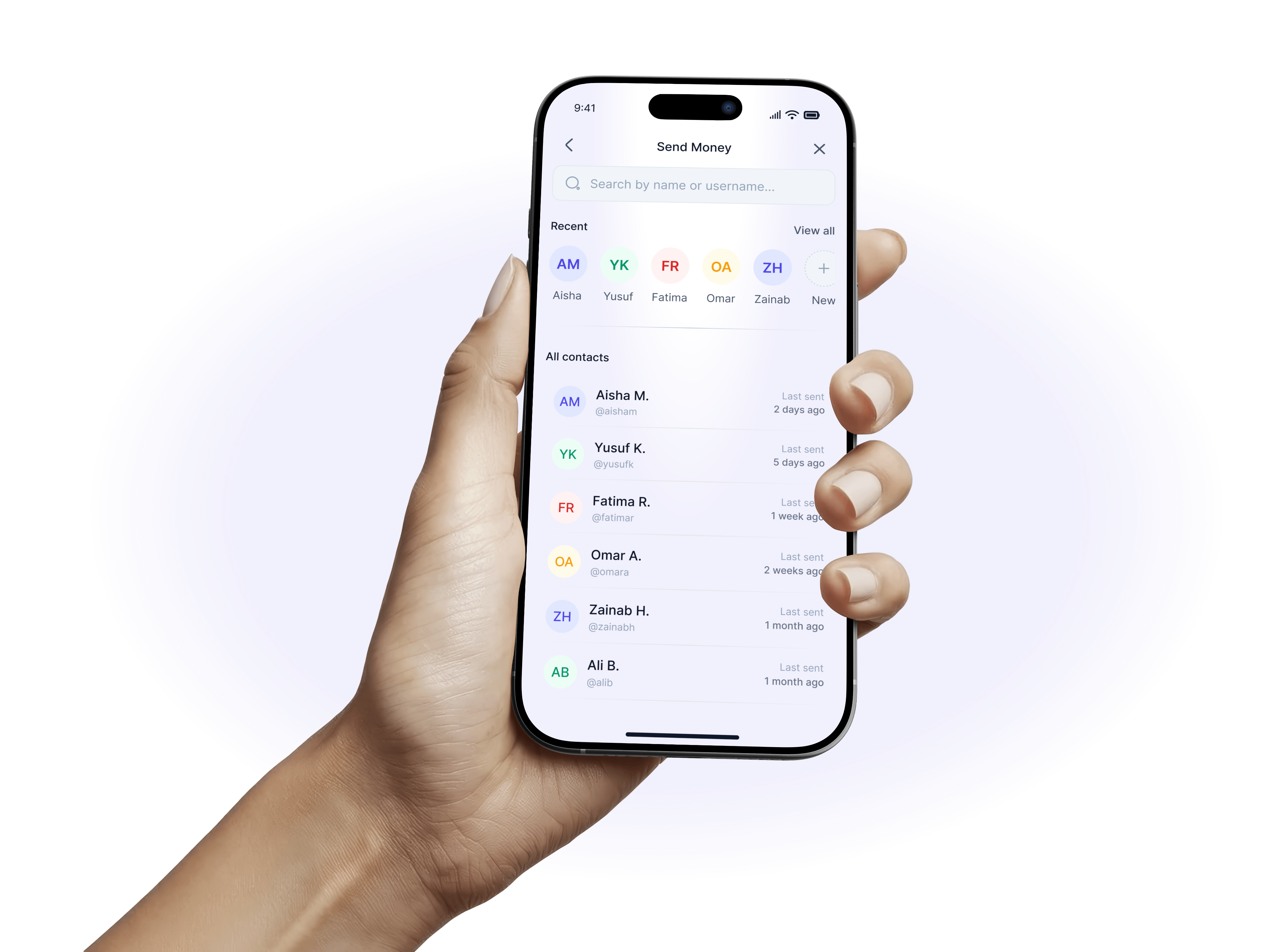
What I built is a send money flow that feels like it was designed for its user, not assembled for a brief. At five screens, it moves quickly without feeling rushed, every screen earns its place, and the experience asks as little of the user as possible while giving them everything they need to feel confident about their money. The edge cases received the same care as the happy path, because in financial products, how a product behaves when something goes wrong defines how much a user trusts it when everything goes right. The Sharia-compliance principles are not a constraint layered on top of the design. They are part of it, present in the language, the fee labelling, the error states, and the overall tone of dignity the product maintains from the first screen to the last. MAL is the result of AI doing what AI does well, and me as the designer doing what only a designer can do.
Reflection
My takeaways
This project deeply reinforced how critical trust, clarity, and explainability are when designing AI-powered systems. Working in a high-stakes space like financial crime prevention showed me that great design goes far beyond visual polish, it’s about helping people make confident decisions, reducing cognitive load, and knowing when automation should step back to allow human judgment.
It also strengthened my belief in the intentional use of AI within the design process. When applied thoughtfully, AI doesn’t just make work faster, it adds depth, sharpens thinking, and allows more focus on solving the right problems.

harles


Copyright 2025 by Charles Nwafor

MAL mobile app
Role
Product Designer
Project Type
Personal Project
Industry
Fintech/Digital Banking
Year
Completed 2026
Mal - Send money case study
AI Gave Me a Blueprint. The Design Was Mine. MAL is a mobile money transfer app.
MAL is a Sharia-compliant money transfer app designed for Muslim users in the UAE. I used AI tools, including Claude and UX Pilot, to generate an initial draft of the send money flow. Rather than accepting that output as finished work, they critically examined it, questioned its decisions, and rebuilt it with genuine craft and conviction. The result is a case study in Design Authorship: the principle that AI can produce a starting point, but only a designer can produce a design. The prompt is not the work. Everything that happens after the prompt is.
The Product: MAL
About MAL
MAL is built for users who want to manage their finances without compromising their values. Sharia-compliant finance demands clarity: no interest, no ambiguity, and no language that obscures what money is doing, and those principles shaped every design decision in the flow. The project was intentionally scoped to the send money journey, the most critical sequence in any transfer product, spanning six screens and two edge cases. The goal was a flow that felt fast, trustworthy, and fully human. MAL was not built for a client, but as a demonstration that AI-assisted design still requires a designer's judgment, taste, and authorship at every step.
MAL
AI-Native App Design
The Challenge
Why this Design
Synthesized money transfer UX challenges and cultural design requirements. Most money transfer apps share the same friction points: too many steps, clinical amount screens, buried note fields, and error states that feel punishing rather than helpful. These are not edge cases but the everyday reality for millions of users who simply want to send money quickly and confidently. For MAL's users, these failures carry extra weight, since a flow that feels rushed, confusing, or undignified is not just poor UX but a product that falls short of their values. The brief required a flow that felt fast without feeling rushed, trustworthy without feeling cold, and Sharia-compliant without making compliance feel like a constraint. It is exactly the kind of layered, human design problem where AI can offer a useful starting point, but only an experienced designer can carry it to a meaningful finish.
Design Process
How I work with AI
Before any design work began, I built a structured brief around what I call Design Axioms: clear principles and boundaries defining what the product should be before any tool is involved. I fed that brief to Claude, which produced a detailed UX Pilot prompt document covering all six screens, and I used those prompts to generate the initial wireframes. The wireframes were functional, logically sound, and correctly applied Sharia-compliance rules throughout. But a starting point was all they were. What AI cannot do is question the brief it was given, sense when something feels spatially wrong, or make a product feel like it genuinely belongs to a specific person in a specific cultural context. I brought that judgment, took what was useful, discarded what was not, and built something the tool alone could never have reached. That is Design Authorship.
The Starting Point
What AI built
The UX Pilot wireframes were not bad, and I think it is important to say that clearly. The flow logic was sound, the screen sequence made sense, and the copy was Sharia-compliant throughout, using language like "service charge" and "transfer not completed" in all the right places. But looking at them screen by screen, the gaps became obvious. Pure white backgrounds gave the product no visual identity, an entire screen was wasted on an optional note field, the review screen never told users when their money would arrive, and every edge case state looked and felt identical regardless of outcome. These were not catastrophic failures, but they were exactly the gaps that separate a wireframe from a genuinely designed product. And closing those gaps was precisely what I was there to do.
Before - UX Pilot wireframe designs
Where I stepped in
The evolution of MAL happened across four dimensions. Structure, UX, Visual Identity, and Copy. Each one represents a layer where designer judgment replaced AI instruction. Together, they represent the difference between a wireframe and a product.
Structure
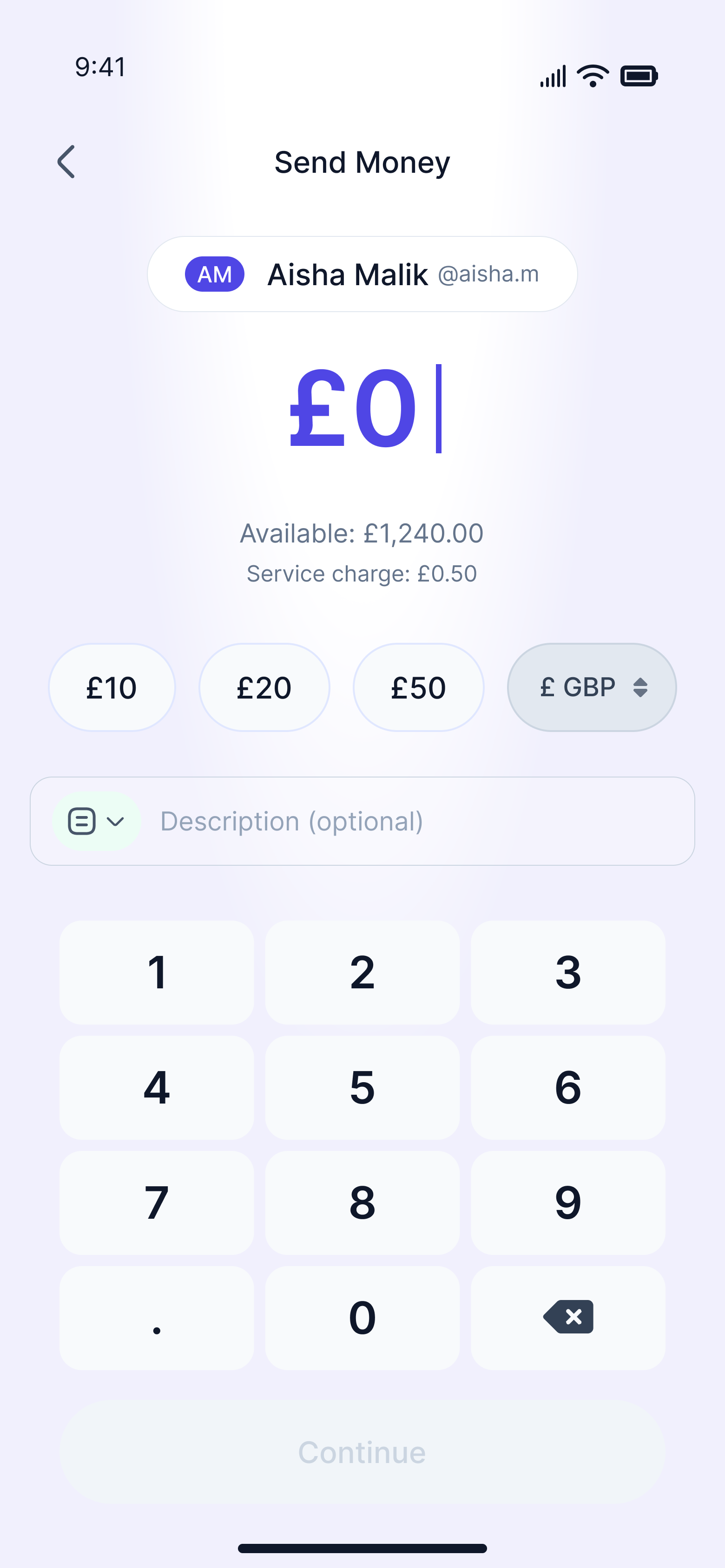
My first question was not how to improve the screens, but whether all of them needed to exist. In one case, the answer was no. The AI had given an entire screen to adding a note, a field my own brief had described as optional, complete with its own navigation, heading, character counter, and skip button. I removed it entirely, moving the description field directly onto the amount entry screen as a compact input, there if you want it and out of the way if you do not. The flow went from six screens to five, and users never have to consciously decide whether to skip a step that should never have been its own step. I also moved the currency selector off its isolated row and into the quick-amount chips row, so one row now does two jobs and the screen breathes better for it.
Structural upgrade from UX pilot vs Final design
UX
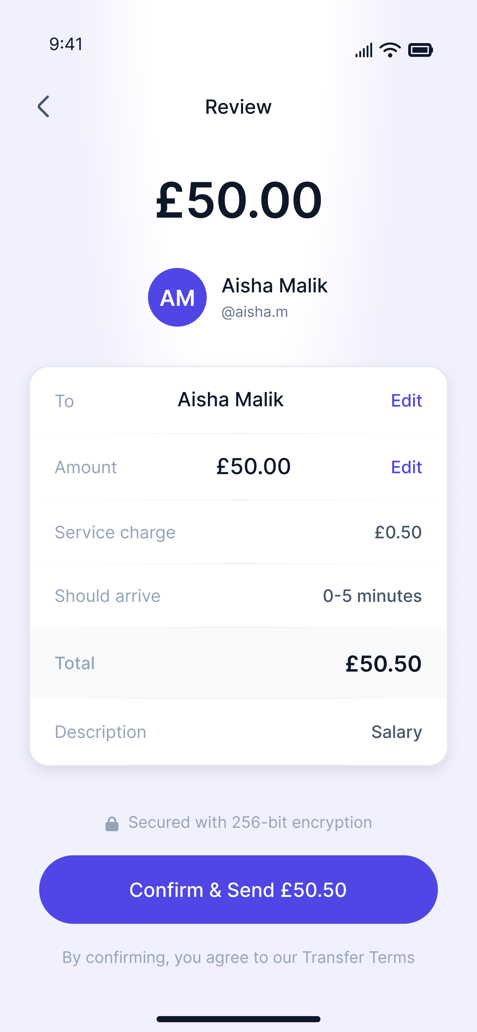
With the structure settled, I turned my attention to how the product actually behaved. I replaced the AI's suggested emoji chips for the description field with a properly structured bottom sheet modal offering contextual preset options like Salary, Gifts, Healthcare and Savings, categories that reflect why MAL's users actually send money. I pinned the Continue button to the bottom of the screen in a fixed position so it is always visible, removing any chance a user has to discover how to proceed. I also designed the description field as a full interaction with distinct empty, focused, filled, and modal states rather than a single static component. The most meaningful addition came on the review screen, where I added an estimated arrival time row to the transfer summary card. For a product built entirely on trust, telling users when their money will arrive is not a nice detail to include. It is a requirement.
Review screen from UX Pilot vs Final design
Copy and paste
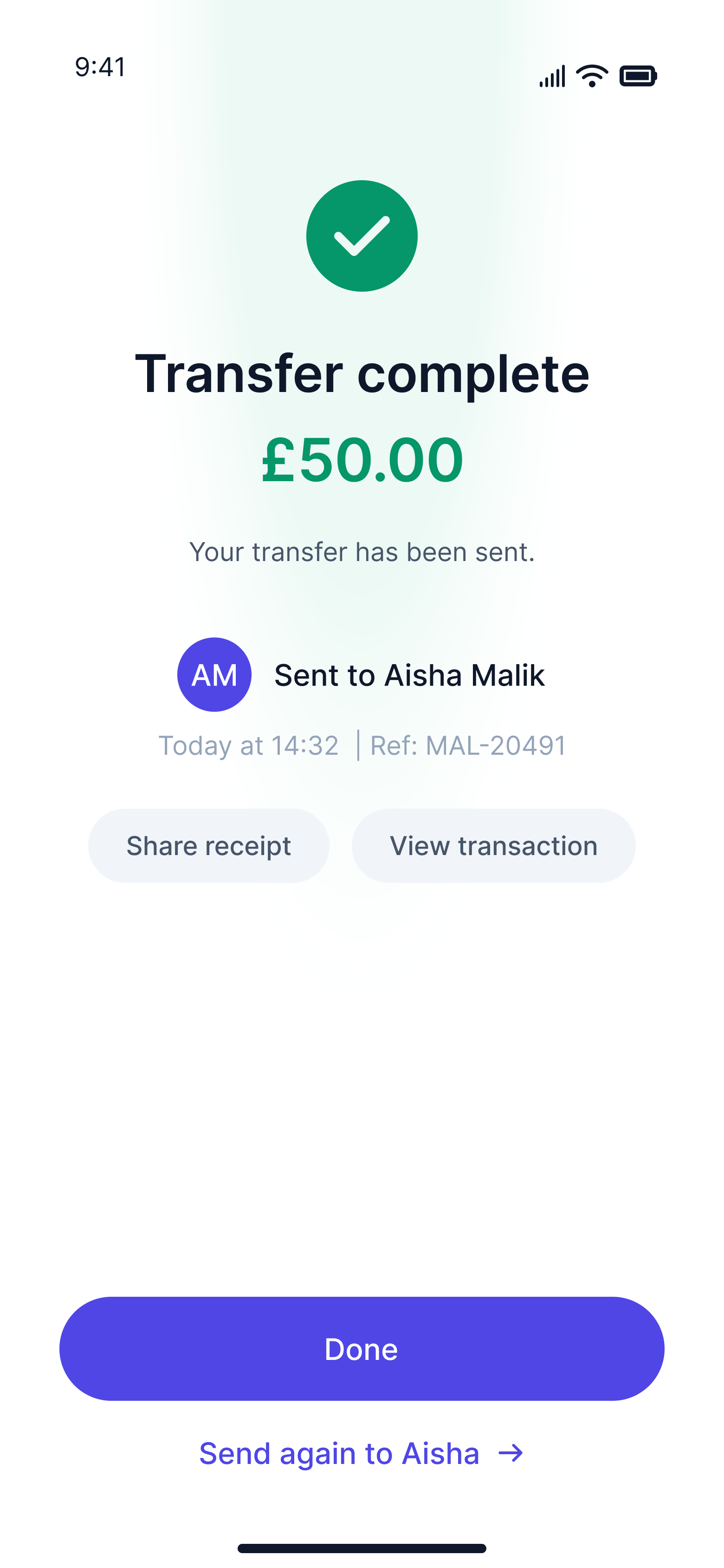
Some of the smallest changes I made carry the most weight. On the delayed transfer screen, I replaced "Got it, back to home" with simply "Done," removing the sense that the app was narrating the user's own action back to them. On the success screen, I changed "Your transfer is on its way" to "Your transfer has been sent," because in a financial product, certainty is more reassuring than warmth. I also moved away from all-caps section labels and inconsistent title casing across the error and edge case screens, because capitalisation carries tone, and the original choices felt institutional rather than human. None of these are cosmetic decisions. They are the kind of precise, considered calls that only come from a designer who understands the emotional register a product needs to hit at every moment. Across twelve decisions and four dimensions, each one closed the gap between what the AI produced and what MAL actually needed to be.
Copy sample from UX Pilot vs Final design
After - Elevated high-fidelity mockups
Decisions that defined the work
Of the twelve improvements made across the MAL send money flow, three stand apart. Not because the others were minor, but because these three required something AI cannot replicate. They required a designer to look at what existed, question whether it should exist at all, and make a call that no prompt could have produced.
Removing the note screen
The AI built a complete, fully specified screen dedicated to adding a note, and by the standards of my own brief, it was correct. It was also wrong, not in what it contained, but in the fact that it existed at all. A screen built around an optional field forces users to make a conscious decision about something that was never mandatory, and every unnecessary step in a financial flow is a moment where someone can second-guess, drop off, or simply feel that the process is longer than it should be. I removed it entirely, moving the description field onto the amount entry screen as a compact, unobtrusive input, present for users who want it and invisible as a burden for those who do not. The flow became one step shorter and measurably more respectful of the user's time. An AI following a brief will always build what the brief describes. It takes a designer to ask whether the brief was right.
Description
Rethinking the description interaction
The AI proposed emoji chip shortcuts for common note categories, and the intent was right: reduce the cognitive load of filling in a free-text field. But the execution was wrong for this user. MAL's users are adults sending money for real, recurring, meaningful reasons, and they deserve a description system that treats their use case with the same seriousness the rest of the product does. I replaced the emoji chips with a structured bottom sheet modal containing categorised preset descriptions, Salary, Gifts and Donation, Savings, Healthcare, each with a contextual icon. It is faster than typing, more dignified than emoji shortcuts, and directly relevant to why this demographic actually sends money. Making that call required knowing who the user is, not just what the brief said about them, and that knowledge does not live in a prompt.
Description
Unique color language for the entire product
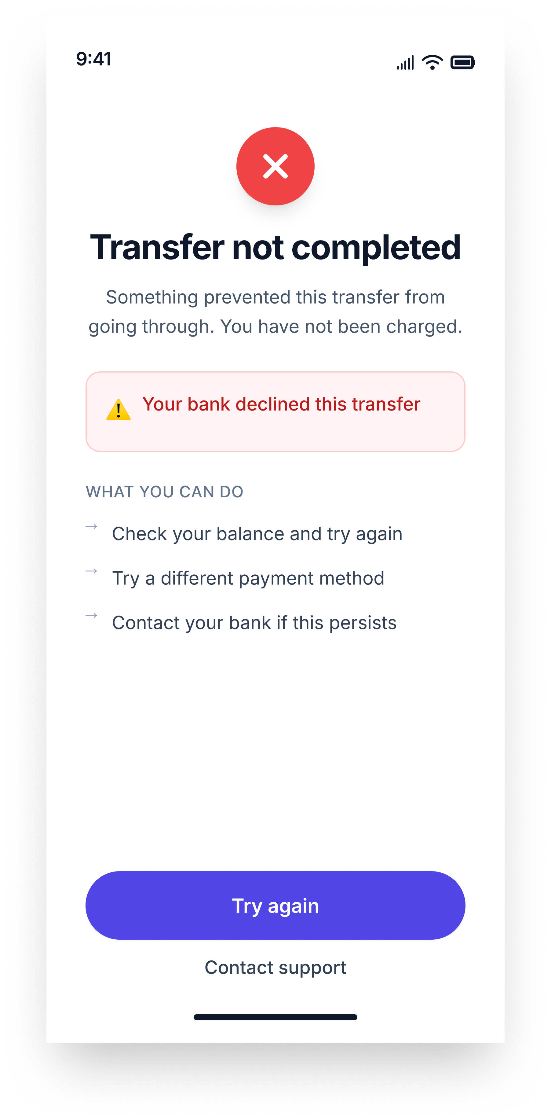
This is where MAL stopped being a wireframe and started being a product. I replaced the AI's pure white backgrounds with a soft periwinkle and lavender tone across all neutral screens, subtle enough not to compete with the content but distinct enough to give MAL a visual identity that does not look like Revolut, Wise, or any other fintech app. I also built a contextual colour language for every outcome state: soft green for success, soft red for a failed transfer, and warm amber for a delayed one, so users feel the difference before they read a single word. The AI had suggested this treatment for the success screen only. I recognised it as a system and applied it consistently across all states, because that is the difference between following a prompt and designing with intent. I also tightened the recipient pill on the amount screen, properly embedding the avatar within the container alongside the name and username to create one cohesive, intentional unit rather than a loosely assembled collection of elements.
Description
MAL: send money flow prototype
The outcome
What was achieved
What I built is a send money flow that feels like it was designed for its user, not assembled for a brief. At five screens, it moves quickly without feeling rushed, every screen earns its place, and the experience asks as little of the user as possible while giving them everything they need to feel confident about their money. The edge cases received the same care as the happy path, because in financial products, how a product behaves when something goes wrong defines how much a user trusts it when everything goes right. The Sharia-compliance principles are not a constraint layered on top of the design. They are part of it, present in the language, the fee labelling, the error states, and the overall tone of dignity the product maintains from the first screen to the last. MAL is the result of AI doing what AI does well, and me as the designer doing what only a designer can do.
Reflection
My takeaways
This case study is not an argument against AI in design. It is an argument for knowing what AI is actually for. AI is a fast and genuinely useful collaborator that can turn a well-constructed brief into a coherent starting point in minutes, but it cannot replace the judgment that happens in the middle: the moment I look at a screen and feel something is structurally wrong before I can explain why, or when a user's cultural context rewrites what a helpful interaction should look like. The brief was mine, the axioms were mine, and every one of the twelve decisions that separated the starting point from the final product was mine. AI accelerated the journey to the beginning. Everything after that was design. Design Authorship means remaining the author of every decision regardless of what generated the first draft, and the designers who will matter most in the years ahead are not the ones who use AI the most, but the ones who know exactly when to override it.
harles
Copyright 2025 by Charles Nwafor
MAL mobile app
Role
Product Designer
Project Type
Personal Project
Industry
Fintech/Digital Banking
Timeline
Completed 2026
Mal - Send money case study
AI Gave Me a Blueprint. The Design Was Mine. MAL is a mobile money transfer app.
MAL is a Sharia-compliant money transfer app designed for Muslim users in the UAE. I used AI tools, including Claude and UX Pilot, to generate an initial draft of the send money flow. Rather than accepting that output as finished work, they critically examined it, questioned its decisions, and rebuilt it with genuine craft and conviction. The result is a case study in Design Authorship: the principle that AI can produce a starting point, but only a designer can produce a design. The prompt is not the work. Everything that happens after the prompt is.
The Product: MAL
About MAL
MAL is built for users who want to manage their finances without compromising their values. Sharia-compliant finance demands clarity: no interest, no ambiguity, and no language that obscures what money is doing, and those principles shaped every design decision in the flow. The project was intentionally scoped to the send money journey, the most critical sequence in any transfer product, spanning six screens and two edge cases. The goal was a flow that felt fast, trustworthy, and fully human. MAL was not built for a client, but as a demonstration that AI-assisted design still requires a designer's judgment, taste, and authorship at every step.
MAL
AI-Native App Design
The Challenge
Why this Design
Synthesized money transfer UX challenges and cultural design requirements. Most money transfer apps share the same friction points: too many steps, clinical amount screens, buried note fields, and error states that feel punishing rather than helpful. These are not edge cases but the everyday reality for millions of users who simply want to send money quickly and confidently. For MAL's users, these failures carry extra weight, since a flow that feels rushed, confusing, or undignified is not just poor UX but a product that falls short of their values. The brief required a flow that felt fast without feeling rushed, trustworthy without feeling cold, and Sharia-compliant without making compliance feel like a constraint. It is exactly the kind of layered, human design problem where AI can offer a useful starting point, but only an experienced designer can carry it to a meaningful finish.
Design Process
How I work with AI
Before any design work began, I built a structured brief around what I call Design Axioms: clear principles and boundaries defining what the product should be before any tool is involved. I fed that brief to Claude, which produced a detailed UX Pilot prompt document covering all six screens, and I used those prompts to generate the initial wireframes. The wireframes were functional, logically sound, and correctly applied Sharia-compliance rules throughout. But a starting point was all they were. What AI cannot do is question the brief it was given, sense when something feels spatially wrong, or make a product feel like it genuinely belongs to a specific person in a specific cultural context. I brought that judgment, took what was useful, discarded what was not, and built something the tool alone could never have reached. That is Design Authorship.
The Starting Point
What AI built
The UX Pilot wireframes were not bad, and I think it is important to say that clearly. The flow logic was sound, the screen sequence made sense, and the copy was Sharia-compliant throughout, using language like "service charge" and "transfer not completed" in all the right places. But looking at them screen by screen, the gaps became obvious. Pure white backgrounds gave the product no visual identity, an entire screen was wasted on an optional note field, the review screen never told users when their money would arrive, and every edge case state looked and felt identical regardless of outcome. These were not catastrophic failures, but they were exactly the gaps that separate a wireframe from a genuinely designed product. And closing those gaps was precisely what I was there to do.
Before - UX Pilot wireframe designs
Where I stepped in
The evolution of MAL happened across four dimensions. Structure, UX, Visual Identity, and Copy. Each one represents a layer where designer judgment replaced AI instruction. Together, they represent the difference between a wireframe and a product.
Structure
My first question was not how to improve the screens, but whether all of them needed to exist. In one case, the answer was no. The AI had given an entire screen to adding a note, a field my own brief had described as optional, complete with its own navigation, heading, character counter, and skip button. I removed it entirely, moving the description field directly onto the amount entry screen as a compact input, there if you want it and out of the way if you do not. The flow went from six screens to five, and users never have to consciously decide whether to skip a step that should never have been its own step. I also moved the currency selector off its isolated row and into the quick-amount chips row, so one row now does two jobs and the screen breathes better for it.
Structural upgrade from UX pilot vs Final design
UX
With the structure settled, I turned my attention to how the product actually behaved. I replaced the AI's suggested emoji chips for the description field with a properly structured bottom sheet modal offering contextual preset options like Salary, Gifts, Healthcare and Savings, categories that reflect why MAL's users actually send money. I pinned the Continue button to the bottom of the screen in a fixed position so it is always visible, removing any chance a user has to discover how to proceed. I also designed the description field as a full interaction with distinct empty, focused, filled, and modal states rather than a single static component. The most meaningful addition came on the review screen, where I added an estimated arrival time row to the transfer summary card. For a product built entirely on trust, telling users when their money will arrive is not a nice detail to include. It is a requirement.
Review screen from UX Pilot vs Final design
Copy and paste
Some of the smallest changes I made carry the most weight. On the delayed transfer screen, I replaced "Got it, back to home" with simply "Done," removing the sense that the app was narrating the user's own action back to them. On the success screen, I changed "Your transfer is on its way" to "Your transfer has been sent," because in a financial product, certainty is more reassuring than warmth. I also moved away from all-caps section labels and inconsistent title casing across the error and edge case screens, because capitalisation carries tone, and the original choices felt institutional rather than human. None of these are cosmetic decisions. They are the kind of precise, considered calls that only come from a designer who understands the emotional register a product needs to hit at every moment. Across twelve decisions and four dimensions, each one closed the gap between what the AI produced and what MAL actually needed to be.
Copy sample from UX Pilot vs Final design
After - Elevated high-fidelity mockups
Decisions that defined the work
Of the twelve improvements made across the MAL send money flow, three stand apart. Not because the others were minor, but because these three required something AI cannot replicate. They required a designer to look at what existed, question whether it should exist at all, and make a call that no prompt could have produced.
Removing the note screen
The AI built a complete, fully specified screen dedicated to adding a note, and by the standards of my own brief, it was correct. It was also wrong, not in what it contained, but in the fact that it existed at all. A screen built around an optional field forces users to make a conscious decision about something that was never mandatory, and every unnecessary step in a financial flow is a moment where someone can second-guess, drop off, or simply feel that the process is longer than it should be. I removed it entirely, moving the description field onto the amount entry screen as a compact, unobtrusive input, present for users who want it and invisible as a burden for those who do not. The flow became one step shorter and measurably more respectful of the user's time. An AI following a brief will always build what the brief describes. It takes a designer to ask whether the brief was right.
Description
Rethinking the description interaction
The AI proposed emoji chip shortcuts for common note categories, and the intent was right: reduce the cognitive load of filling in a free-text field. But the execution was wrong for this user. MAL's users are adults sending money for real, recurring, meaningful reasons, and they deserve a description system that treats their use case with the same seriousness the rest of the product does. I replaced the emoji chips with a structured bottom sheet modal containing categorised preset descriptions, Salary, Gifts and Donation, Savings, Healthcare, each with a contextual icon. It is faster than typing, more dignified than emoji shortcuts, and directly relevant to why this demographic actually sends money. Making that call required knowing who the user is, not just what the brief said about them, and that knowledge does not live in a prompt.
Description
Unique color language for the entire product
This is where MAL stopped being a wireframe and started being a product. I replaced the AI's pure white backgrounds with a soft periwinkle and lavender tone across all neutral screens, subtle enough not to compete with the content but distinct enough to give MAL a visual identity that does not look like Revolut, Wise, or any other fintech app. I also built a contextual colour language for every outcome state: soft green for success, soft red for a failed transfer, and warm amber for a delayed one, so users feel the difference before they read a single word. The AI had suggested this treatment for the success screen only. I recognised it as a system and applied it consistently across all states, because that is the difference between following a prompt and designing with intent. I also tightened the recipient pill on the amount screen, properly embedding the avatar within the container alongside the name and username to create one cohesive, intentional unit rather than a loosely assembled collection of elements.
Description
MAL: send money flow prototype
The outcome
What was achieved
What I built is a send money flow that feels like it was designed for its user, not assembled for a brief. At five screens, it moves quickly without feeling rushed, every screen earns its place, and the experience asks as little of the user as possible while giving them everything they need to feel confident about their money. The edge cases received the same care as the happy path, because in financial products, how a product behaves when something goes wrong defines how much a user trusts it when everything goes right. The Sharia-compliance principles are not a constraint layered on top of the design. They are part of it, present in the language, the fee labelling, the error states, and the overall tone of dignity the product maintains from the first screen to the last. MAL is the result of AI doing what AI does well, and me as the designer doing what only a designer can do.
Reflection
My takeaways
This case study is not an argument against AI in design. It is an argument for knowing what AI is actually for. AI is a fast and genuinely useful collaborator that can turn a well-constructed brief into a coherent starting point in minutes, but it cannot replace the judgment that happens in the middle: the moment I look at a screen and feel something is structurally wrong before I can explain why, or when a user's cultural context rewrites what a helpful interaction should look like. The brief was mine, the axioms were mine, and every one of the twelve decisions that separated the starting point from the final product was mine. AI accelerated the journey to the beginning. Everything after that was design. Design Authorship means remaining the author of every decision regardless of what generated the first draft, and the designers who will matter most in the years ahead are not the ones who use AI the most, but the ones who know exactly when to override it.
Other projects
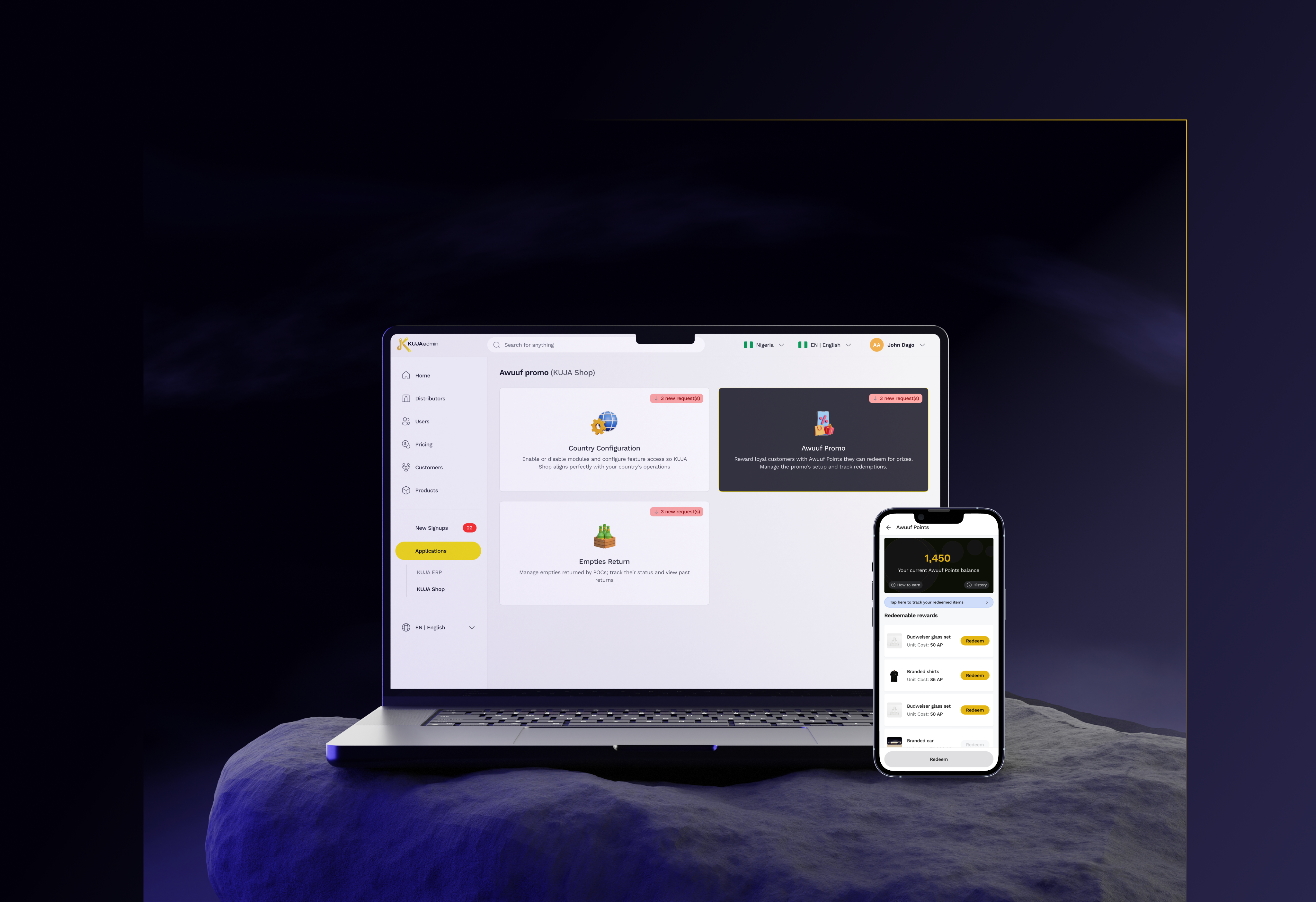
KUJA Awuuf
Kuja Awuuf app feature
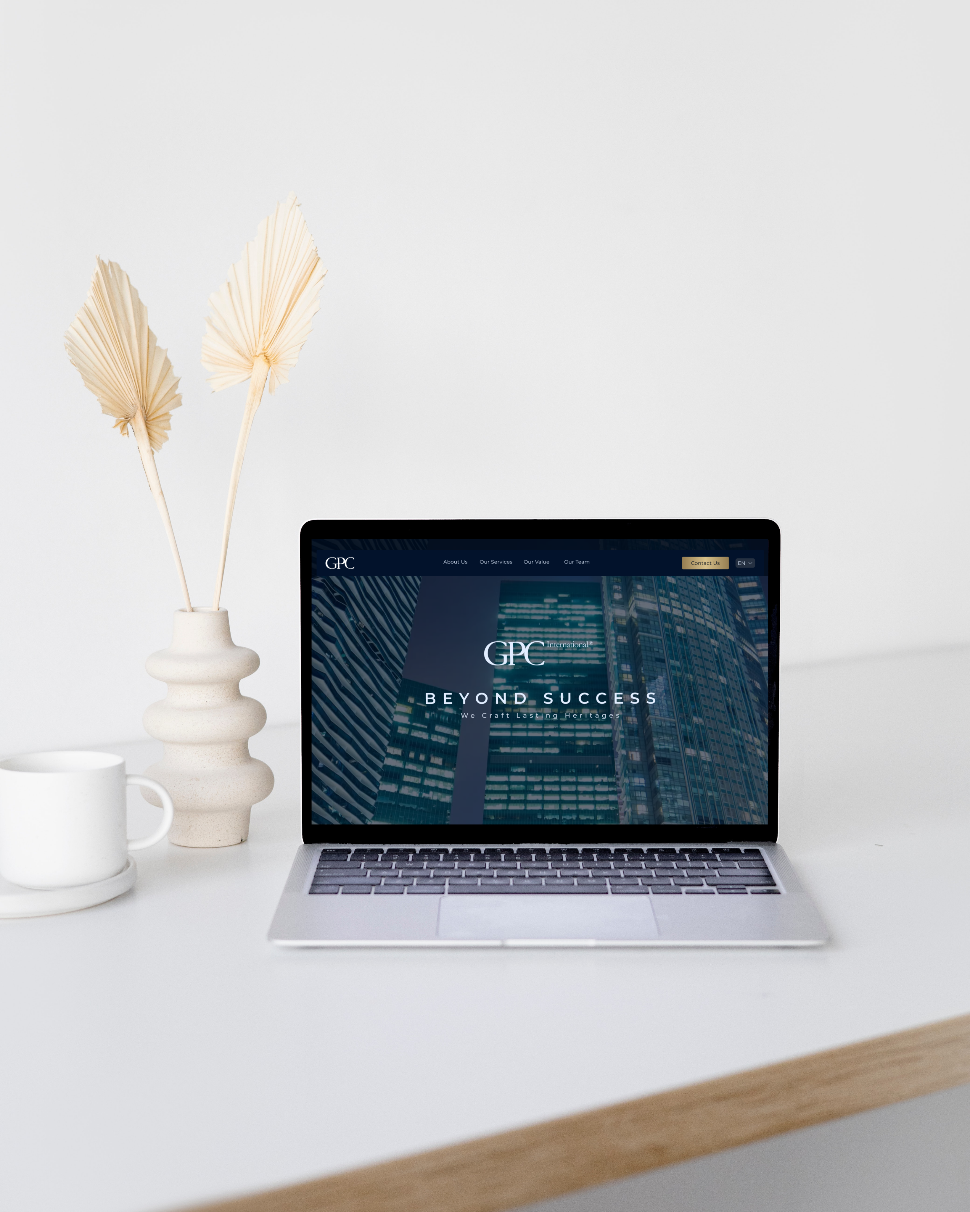
GPC International
Website design for GPC International brand.
harles
Copyright 2025 by Charles Nwafor